Pop fizz clink
Whether you’re selling your house, christening a yacht or toasting the birth of a child, Champagne is a symbol of success. But forget old world glitter and gold, Champagne marketing is going minimalist.
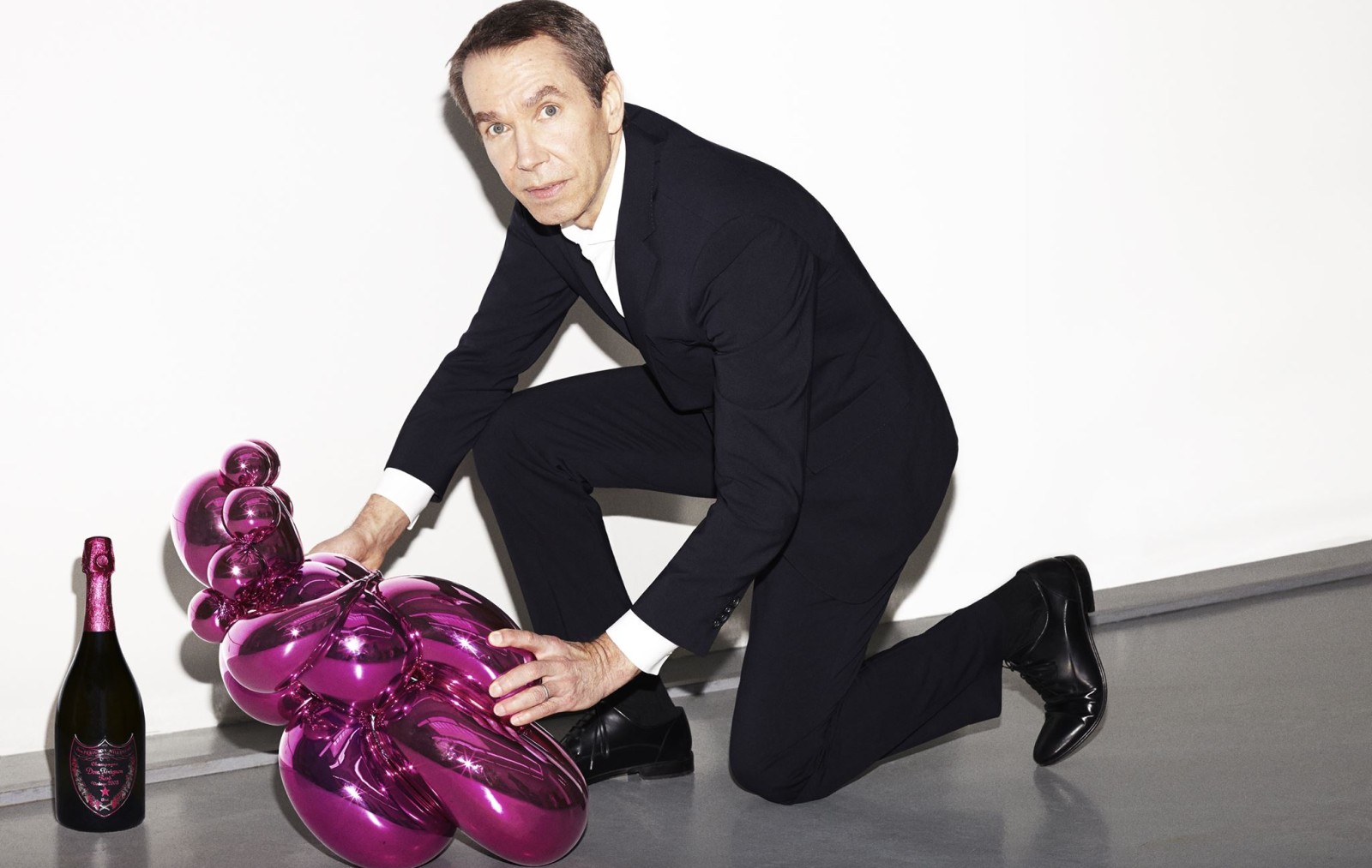
Over the last eight years, Björk, David Lynch, Jeff Koons and Karl Lagerfeld have all stepped up to design Champagne packaging. Suddenly gone are the cavalier on horseback and coat of arms. A modern Champagne label is just as likely to sport a symbolic cross or QR-code. Behind the scenes, the work of repositioning Champagne as an every day wine and a wine of gastronomy has commenced. And with this has come a paring back of traditional label design. Almost, without anyone noticing, the gentlefolk of the Champenois have changed their tact and are trying to make Champagne more accessible.
According to Thibaut Le Mailloux, Director of Communications for Comité Champagne in France, it’s because the prestigious nature of Champagne is now firmly established. “You don’t need gold and arabesque on your label to say that Champagne is prestigious. The word Champagne alone says it all already,” Le Mailloux says.
“The classicism of Champagne as a very complex wine, very technically difficult to elaborate, is not contradictory with contemporary design. Today luxury brands are also doing designs that are not always in the classic vein. They play with contemporary art and so Champagne also, is starting to get into that field, and to be able to make itself more relevant to a younger audience,” he says.
The end result is a look and feel that’s casually elegant, a smash up of high and low culture. On Instagram we see Krug styled with ceramic plates and a marble counter. While on the LVMH feed, a luxury picnic next to a glistening waterfall, has become accustomed to having a bottle of Dom P thrown into frame.
In New York, Vice President for Dom Pérignon, Trent Fraser says they have to keep moving to keep things fresh. “From a brand perspective, we try to balance the right mix of edge and positioning. We are always true to our DNA and codes, but continue to push boundaries and take risks,” Fraser says.
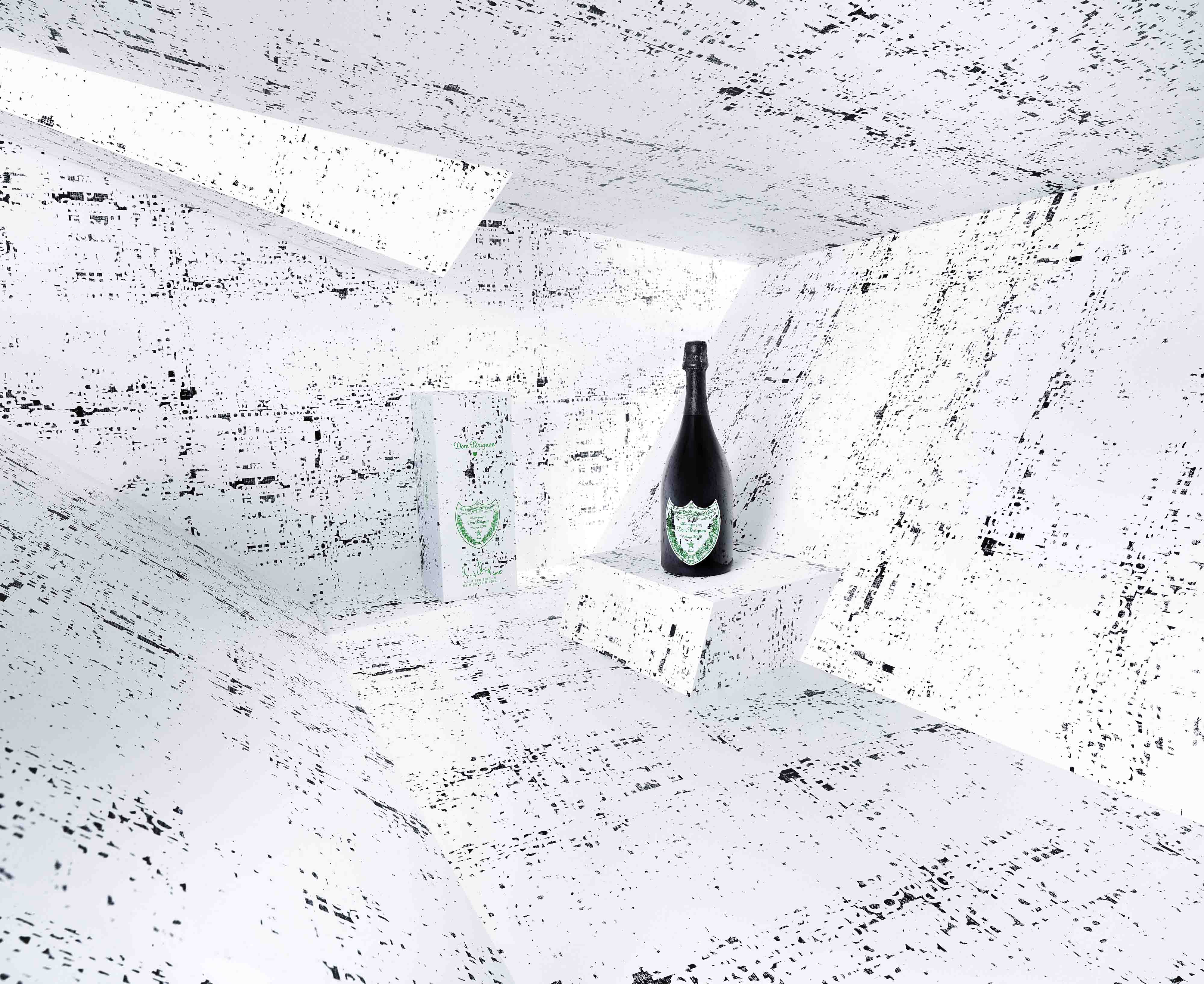
“A good example is how we utilise our communication platform, which is built around the Power of Creation. As Dom Pierre Pérignon was the original creator of Champagne back in 1668, we celebrate that and bring it to life through collaborations such as those with Andy Warhol, David Lynch and Jeff Koons,” Fraser says. “The only time that we ever modify or ever touch our bottle, is in our Limited Edition creator pack which we launch for the holidays. It’s a gifting occasion as much as a collectible.”
Despite the fact that there are over 5,000 brands that hark from the region of Champagne, many of us can only name a few. At a wine store or in bar setting, we rely on the regal red of Bollinger, the yolk yellow of Clicquot to achieve vital brand recognition. But in order to meet global demand, Champagne bottles are becoming more minimalist and paring back labels to suit the developing middle class, often places where English is a second language, never mind French! Oui, labels are being radically Anglofied and stripped back to just the essentials.
In Reims, at the very seat of Champagne, Lauranne Bismuth Events and PR Manager for Maison de Champagne Krug, admits they try to simplify their brand for new consumers. “We believe it is crucial for the House to evolve with its time. The label has to reflect this and be contemporary,” Bismuth says.
“With the Krug label, the objective really is to focus on the main information, and to ease the understanding and the presentation of Champagne. No one drinks Champagne for any other reason than pleasure! So why should it be complicated? We believe you should never need to be an expert to understand Krug Champagnes.”
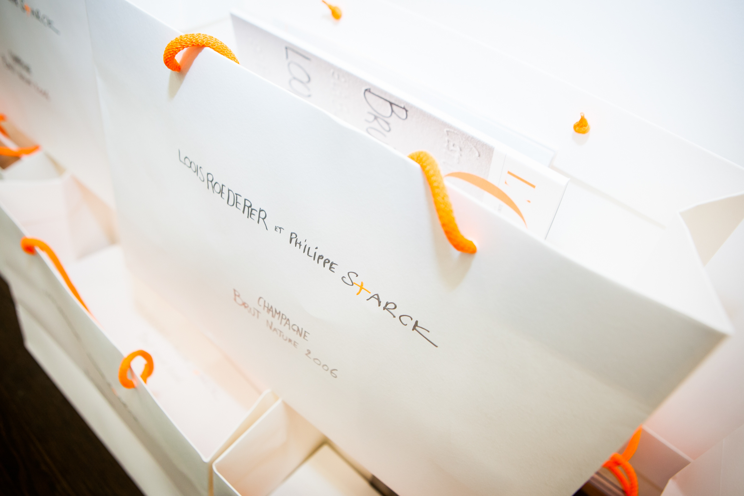
As Bismuth points out, modern marketing is making a true effort to make Champagne easier to approach. And although minimalism is most often associated with art, architecture or design, today these worlds are colliding in the realm of Champagne marketing. Philipe Starck’s bottle for Louis Rogederer’s 2006 Brut Nature was a knock out. A child’s hand scrawled across the label. An orange cross left dangling in a sea of white. It was a show stopper by Champagne labelling standards. And in this case it was done to demarcate the radically different flavour profile inside the bottle.
Peter Bourne, an Australian based wine critic, finds the extent of label tampering bewildering. “One of the silly little things I do, is that when I am watching television or the I am watching a film, I can often recognise what they are drinking – like that ‘that is a bottle of Dom Pérignon or that is Pol Roger,’ Bourne says.
“But it’s getting harder and in general I am staggered by how often these companies are changing their labels. I mean, I have been in the business for forty years and I am saying that for some houses I have seen maybe four different labels in that period of time which is really, just astonishing.” So is he being a stick in the chalk or does he hold a point?
“I am a purist in the sense that I don’t think the original label should be mucked with,” Bourne says, warning all wine marketers in every land to keep their fingers out of meddling with this essential part of marketing.
Brisbane-based Champagne Educator Bernadette O’Shea agrees. She says Champagne label could be most closely compared to Chanel No. 5, another classic French product sold globally. “It’s always classic. They never change it. They might alter the packaging a bit and get someone new to do the ads, but Chanel No. 5? You know it a mile off. If they were to change that label and put pop art on the bottle it just wouldn’t work – people just wouldn’t buy it,” O’Shea says. This push and pull between both tradition and modernity, luxury and commercialism brings a surprising twist to labels right now with each house taking its own position.
Elisabeth Drysdale, director of the Champagne Bureau in Australia, says that for Australians – the world’s 6th largest consumer – overt brand recognition is still key. “Australia remains an important and robust market for Champagne. In 2015, we imported 8,110,106 bottles of Champagne, which represents a 24.3% increase on 2014,” Drysdale says. She agrees with 2016 Vin de Champagne judge Peter Bourne that while tweaks and changes can be made to Champagne labels, Australians still want to know what’s in the bottle.
According to Peter Bourne, The Wine Man, you can change the inside of the bottle a bit but please leave the bottle alone. “In Australia, brand recognition comes back to labels. Traditional labels are there for a reason and yes you can keep tweaking them – but the colour, the capsule and the label must be maintained so you can get that brand recognition from consumers in the retail environment,” Bourne says.
He explains that it was partially the mandatory inclusion of back labels on imported products here that has freed up ‘real estate’ on the front label to become more minimal. But he cites the world’s most successful labels (Clicquot’s yolk yellow and Bollinger’s red) as the very best examples. Those grand marques that, quite literally, survive by staying true to their roots.
What to read next?