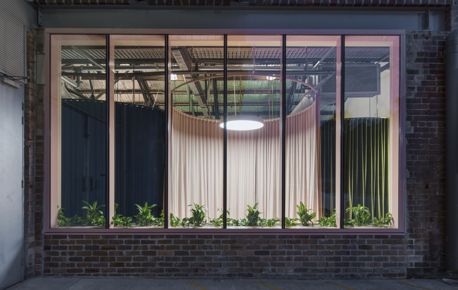
Behind the velvet curtain: BresicWhitney Rosebery
In the far corner of a revitalised warehouse quarter in southern Inner Sydney, the new BresicWhitney Rosebery was recently unveiled, and it’s arguably this brand’s most ambitious office yet.
Now renowned for individualistic sites, the launch continues the collaboration between the property brand and Chenchow Little Architects. CCL was also behind the landmark Darlinghurst HQ as well as a warehouse revamp in Balmain, and a modern shopfront overhaul in Hunters Hill.
The CCL approach has been driven by the neighbourhood perspectives of these areas. Darlinghurst with its gritty qualities, Hunter’s Hill with more refined materials, and Balmain a simple warehouse amid a residential strip. The Rosebery office similarly echoes the area’s profile as one of Sydney’s first model industrial suburbs, with factories and warehouses slowly being converted into commercial tenancies and apartments.
The latest project brief was typically loose – another continuation of the BresicWhitney CCL relationship. While the first project brought a level of detailing and craft that would normally apply to a house, this one (and the others) doesn’t duplicate or repeat aesthetics.
The revelation re-imagines what can be done with these heritage-listed warehouse tenancies in Rosebery. Working with limited budgets and timeframes, the office interior is designed as a theatre-set, without solid walls to reduce cost and fast-track completion.
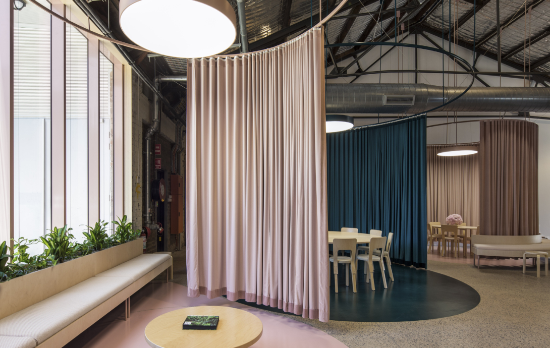
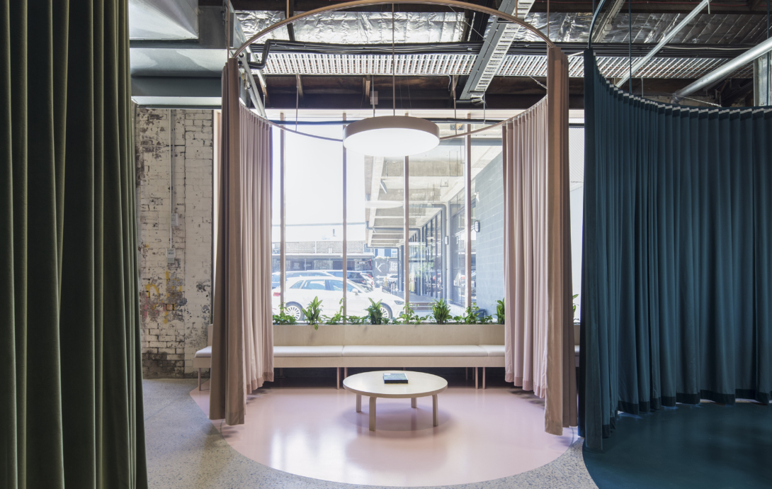
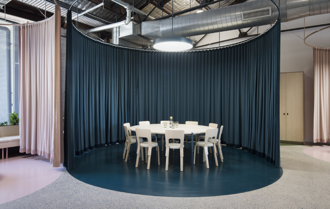
Circular working and meeting pods are arranged with wrapping perimeter curtains, creating both installation piece and spatial purpose. Once it houses a full team, 25 people can intertwine across the 3 pods of varying size, encouraging collaboration and allowing flexibility for different team sizes and the staging of increased staff levels.
The curved geometry is a counterpoint to the warehouse grid, and diagonally links the existing street and rear precinct entry. The placement of each pod guides circulation and movement, drawing the visitor towards the central reception area.
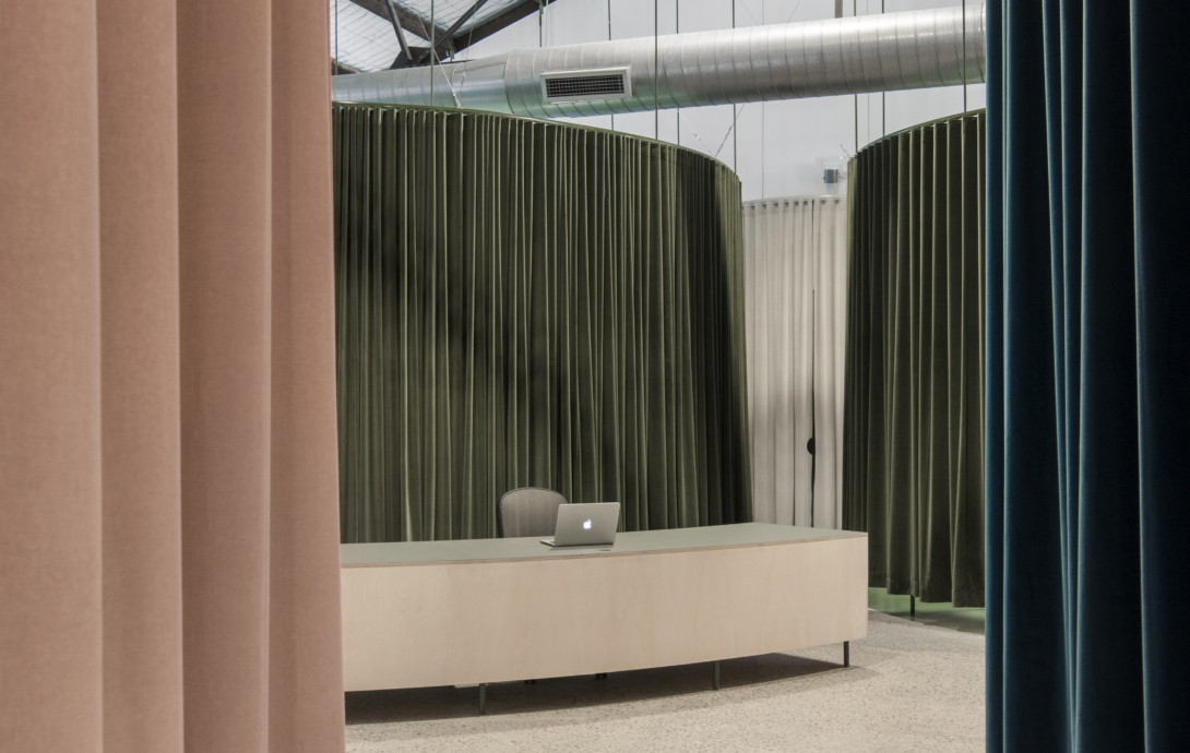
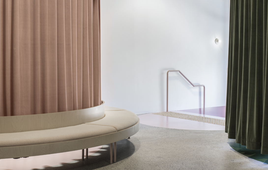
Velvet curtains inject opulence and surprise to an office interior, and are paired with low-tech materials such as birch plywood and industrial concrete paint. The majority of joinery and furniture is custom-designed in plywood to continue the circular geometry and reduce the palette of materials. Vintage 1900s colours such as olive green, indigo blue and pastel pink were selected to reflect the buildings heritage and denote each pods function.
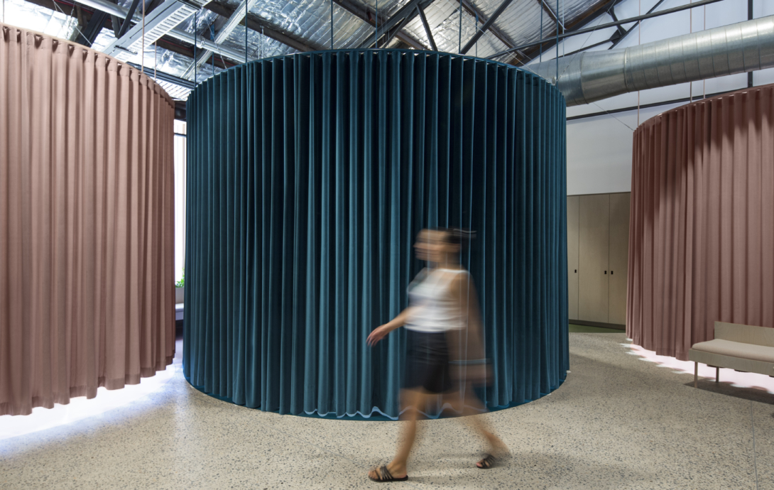
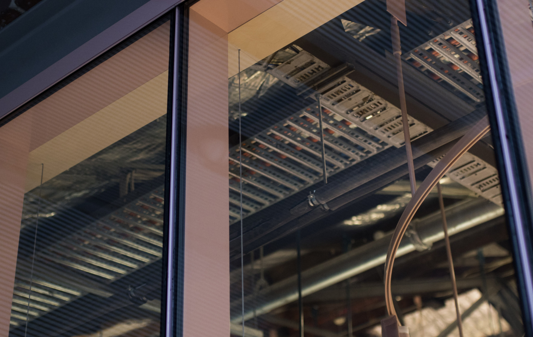
Curtain tracks are suspended from the pitched warehouse ceiling, retaining the overall coherence of the warehouse, and the thick velvet curtains are raised above the floor, creating the strange appearance of a weighty mass hovering in mid-air.
The endless configuration of curtain positions and rich layering of vintage colours creates an elemental and always-changing interior experience, flexible in both its mode and appearance, creating the maximum effect with an economy of moves.
The preceding BresicWhitney offices have become known for their role as satellite art galleries, housing a corporate collection. Shannan says the collection is reflects the brand. “It’s representative of the fact that we are contemporary, progressive, edgy, that we are prepared to be bold and risk taking,” he says.
“I think art does say a lot to people about who we are.”
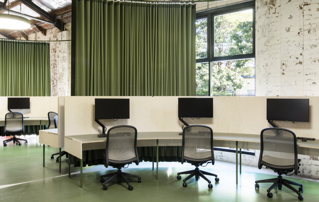
While the Rosebery office does nail Shannan’s brief of being a ‘lovely place to work’, a glance around doesn’t reveal much gallery-like blank space or white walls.
But if a successful art collection will evolves over time, reflecting shifts and changes in a business, then, perhaps, any art has to go on that journey too.”
“Maybe the space is more suited to sculpture,” Shannan says. “That would be interesting.
See more from Chenchow Little Architects’ side in Inside Magazine here.
And looking back at 2015, the Hunters Hill office is showcased in Artichoke Magazine here.
