Love and grit
In the 21st century everything employers once held dear has radically changed. The old hierarchical paradigm has flipped. Today good management is much more about how much employers can invest in their staff, rather than how much they can take out.Happy employees build better companies, give better service and stay longer in their roles. And though most of us spend 50 percent of our lives indoors and at work, only 20 percent report being fully engaged.
Happiness at work is the new aspirational privilege of Western society.
Future proofing offices today means creating playgrounds for collaboration and cooperation. It’s not about the corner office or the Old Boy’s Club. In the new equation, cool environments are open and non-hierarchical. They’re dotted with zones for innovation and creativity.
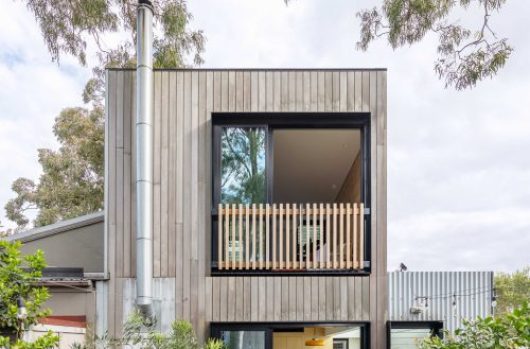
At BresicWhitney, where design is at the very heart of the business, creating a dynamic office environment was placed in the hands of architects Chenchow Little. Shannan Whitney first invited Tony Chenchow and Stephanie Little to create the current Darlinghurst office, back in 2009.
“I wanted the best design outcome for the space and I felt Chenchow Little were the most equipped to deliver that,” says Shannan Whitney, co-founder of BresicWhitney. In response to the brief, Chenchow Little took an unorthodox approach. This month Artichoke Magazine ran a feature on Chenchow Little’s Hunters Hill office. Flipping through the pages, we thought it a timely moment to sit down with Chenchow and reflect on all the three BresicWhitney spaces they’ve designed at Darlinghurst, Balmain and Hunters Hill. As we sit back together, Chenchow is quick to point how each office responds to BresicWhitney’s art collection, work culture and suburban context.
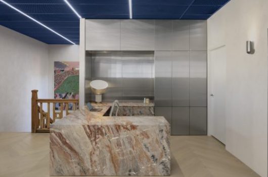
“Art is very important to Shannan. He’s an avid collector of contemporary art,” says Chenchow.
“He wanted his passion for artwork to be a part of the office environment. He wanted to create that culture for his business,” says Chenchow, remembering the challenges of the original brief.
“Initially, it was quite daunting because we had a brief for a typical commercial office environment as well as an art gallery. We had to bring those two uses together.” According to Shannan Whitney, art was important from the beginning for a couple of reasons.
“Art was introduced consciously quite early on. It was an important mechanism to connect customers with our brand within a physical space. It is also a nice connection piece for our staff,” Whitney says. “There are a couple of main things about the art, it’s unexpected, which is great. Like all art is supposed to do, it prompts a response which is valuable and it helps people connect our brand, with our vision,” he says.
“All three offices were designed around the artworks – that was probably the most important thing,” says Chenchow. “Secondly, each one had to respond to the clientele in that area. Thirdly, because the average age of BresicWhitney staff is in their early twenties, we were designing for a young audience. Designing a space that promotes cooperation and engenders collaboration.
“Darlinghurst has a very abstract and gritty interior. We left the raw concrete walls, exposing the surface of the ceilings and the concrete. It’s axial and gridded. Art pods, meeting rooms and pergolas are all connected by ‘streets’. Yet the façades are all transparent and very permeable. You can take short cuts around the space, and track through the rooms when they are open and not being used for meetings. You can also use curtains and sliding doors to screen meetings or create privacy,” Chenchow says.
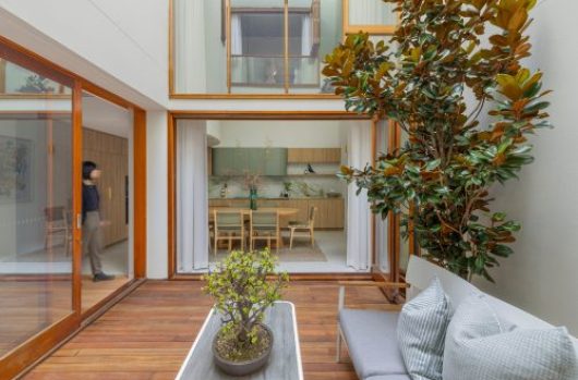
“With Hunters Hill the detailing is a much more refined, the materiality is richer, and with the use of timber and brass – I feel it suits the Hunters Hill clientele or that catchment area.
“Balmain is a lot more free form, a lot more fluid. You can see the curved walls, the meeting rooms and the art pods. There is a more clearly defined front of house and back of house, but the artwork and the curved walls all help create a very different experience.
“In all three offices if you want to wander – you can do a lap or circle. We basically used urban design principles in all three offices. It is really thinking about the office, as people think about the city. The office has people working in it, the city has people living in it, and these days the working environment is not so much about working, but you also dwell in the that space too, so the line between work and play is now becoming blurred,” he says.
As Chenchow explains each office has art as a core element, each office is a different expression of its urban context. “Darlinghurst with its regular shaped site is very much reminiscent of a typical gridded street pattern, and that grid is quite rigid. Like Paris after Haussmann. With Hunters Hill, the street pattern is I guess a lot more Baroque. Like a medieval Italian hill town. There are kinks, there are twists, and the meeting rooms are all placed at an angle to each other. And then you have Balmain that is completely different, because that really isn’t about streets. It’s amorphous,” Chenchow says. What is common, he admits across all three offices is the art defining the space and the effort to expose the surfaces.
Chenchow says what excited him about the brief was taking a very different approach to the industry standard.
“There isn’t a branding or house style in the BresicWhitney spaces. If you look at other property companies, the branding is very clear. We have approached it in a totally different direction.”
Shannan notes the lack of branding in the space is key to understanding the business approach.
“I felt traditional and conventional real estate devices weren’t appropriate, or that they would have just got in the way of the brief. I wanted the space to have a design solution that incorporated all the right things, but also gave Chenchow Little enough creative rope to deliver the best outcome. I never felt that the design solution needed to be industry specific.


