Outside the box
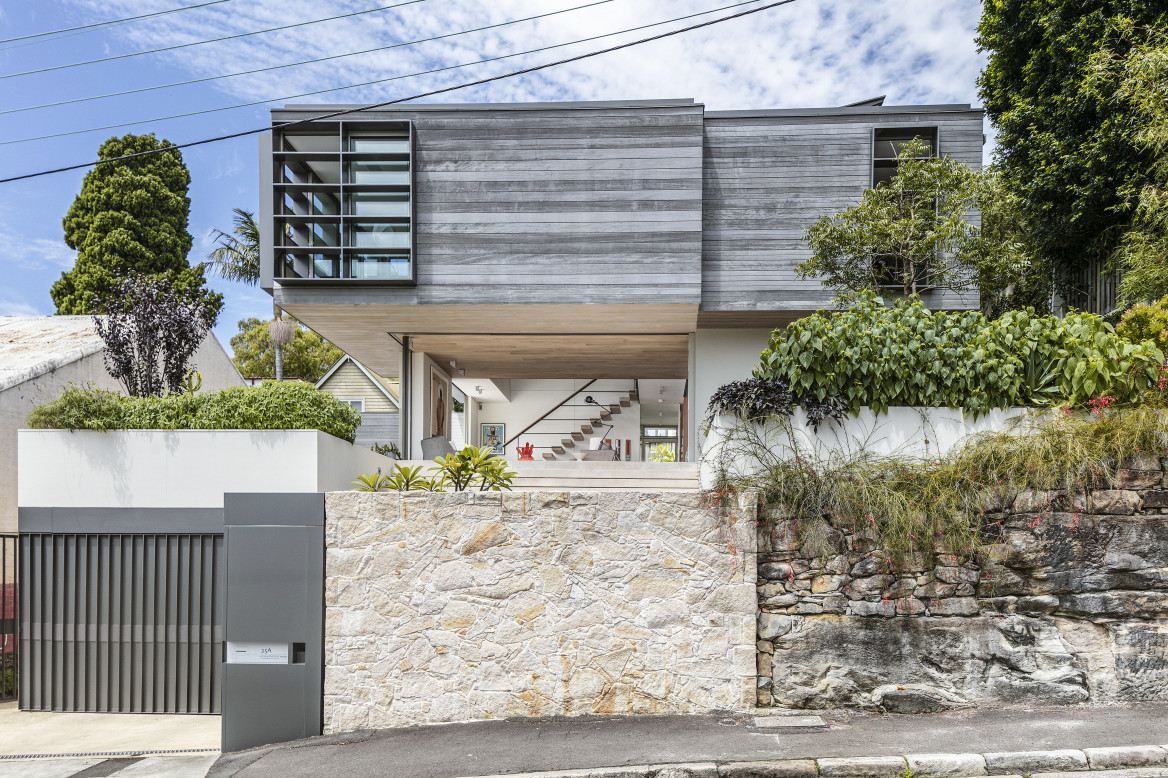
It’s an oft-admired Balmain residence that would turn even more heads if it wasn’t for its tucked-away location.
Still, for locals and anyone else wandering these quiet back streets of this Sydney Peninsula, 25A Clayton Street, Balmain commands attention. Floating above its surroundings, the house is the creation (and long-term home) of architect Thom Silvius.

Now 10 years old, it’s as spatially relevant as ever, an impressive feat that evokes a beautiful sense of comfort and home.
The primary objective for the design of 25A Clayton Street was to create a light-filled modern house where the edge between the inside and outside disappears. It was also important that the massing of the house have a sculptural quality.
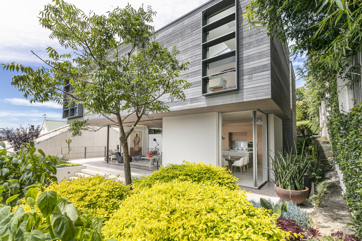
Silvius’s cues came from the renowned Ponce House by Chilean Architect Mathias Klotz, one of the major exponents of Modernist movement.
“The Ponce house has many wonderful features,” Silvius says. “But the two that inspired me the most are the dramatic procession to the front door and the way the massing of the upper level floats above the lower levels – it is an amazing structural feat. Klotz’s design features large expanses of glass and a beautifully curated selection of materials. The first floor timber box floating above the glass enclosed ground floor pay homage to Klotz’s work.
“25A Clayton Street is located on a sandstone outcrop approximately 4m above the street. While I was making and refining the model, it seemed to me that the house, perched up on the sandstone, was reminiscent of the architecture associated with Greek temples. Most temples are situated on a plinth, with a grand staircase that connects them to the ground. This was the inspiration for the 5M wide steps that form the last leg of the journey up to the house.”
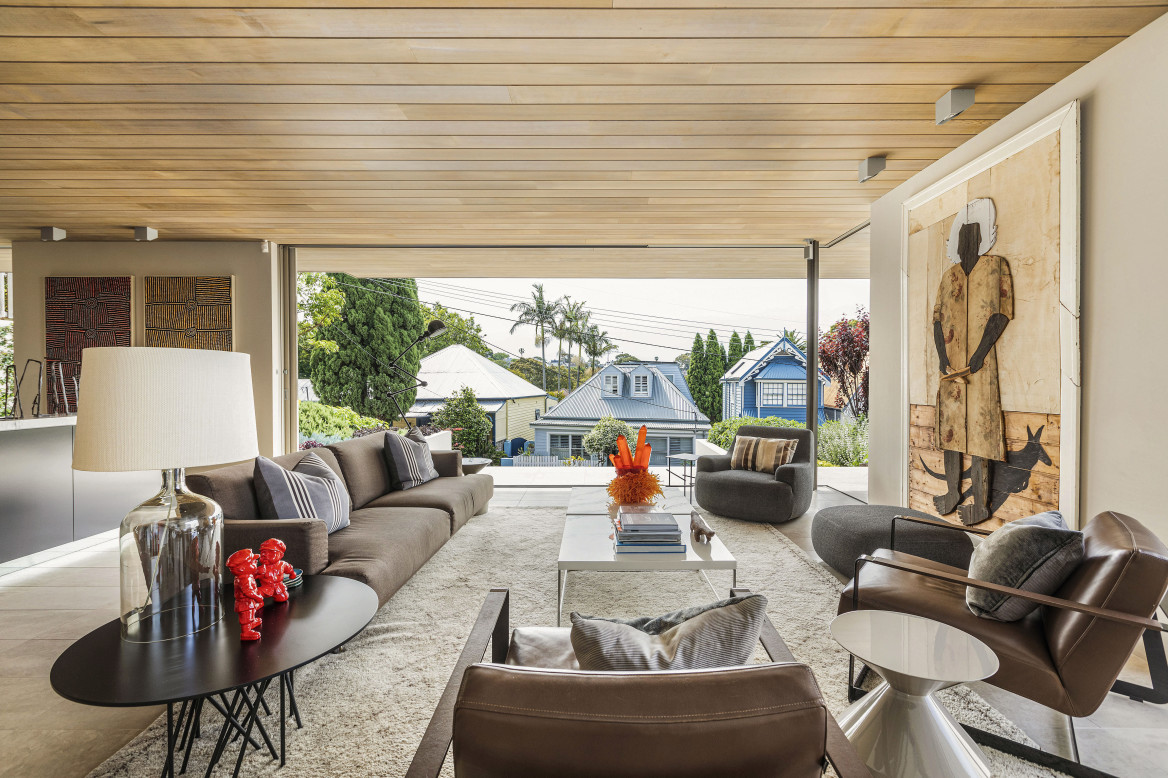
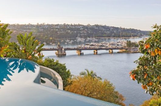
The original house was a weatherboard cottage that had good views of Mort Bay, North Sydney, and the Harbour bridge. Living in the house for many years before the design process provided insight into how to organise the spaces, maximise the views, provide privacy, and work with the prevailing weather conditions experienced on site. The original living room was in relatively the same position as the new upstairs living room.
“We loved how the original room felt,” Silvius says. “It hovered above the street – like a tree house. The room had great views and its’ high position captured breezes from the harbour. We knew we wanted to replicate that space in the new design and this is why there is a second living room and why it was located on the upper level.”
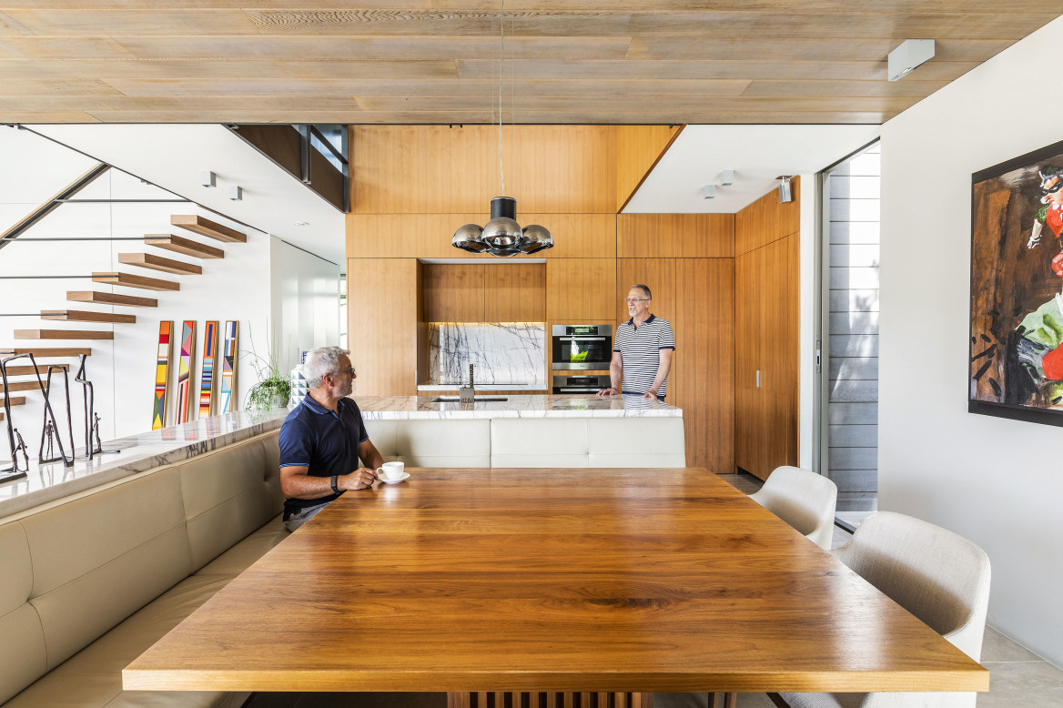
After ascending the staircase from the street, you enter the house on the ground floor which consists of the living room, dining room, and kitchen. The public spaces are in the front and the guest rooms in the back. These living spaces are located on the street side because it is considered the best spot on the block. It has access to sunlight throughout the entire day and is more private than the backyard.

“We knew that Clayton Street was a very quiet street and that our neighbours entertained in their backyards, Silvius says. “These two facts solidified the notion that we could live on the street side without any negative impact. In essence, we claimed the street. The elevated position provides privacy and wonderful views to Birchgrove.
“I deliberately wanted the two living spaces to have a sense of connection, so that the space flowed upward, hence the voids. I wanted visitors to arrive on the ground floor and get a sense that there was still more to explore upstairs.
“In practical terms, the house functions exceedingly well, it is easy to use, it feels warm and inviting, and it has an amazing sense of space. There is an interconnectedness – between room to room and floor to floor. Sometimes when climbing the stairs from the ground floor to the upper living room, I look at the view of the two living rooms together and I stop to appreciate what we have created.”
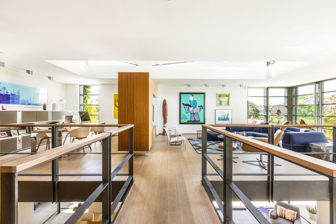
The butterfly roof was an experiment that proved to be a great success. Throughout the day, it lets light into the house, but it also doubles as a thermal chimney, ventilating hot air in the summer. The Butterfly ceiling adds beauty to the upper living spaces, with sculptural and visual interest to what could have been a large, flat expanse of plasterboard. Without it, the upper living spaces would not feel as light and as uplifting.
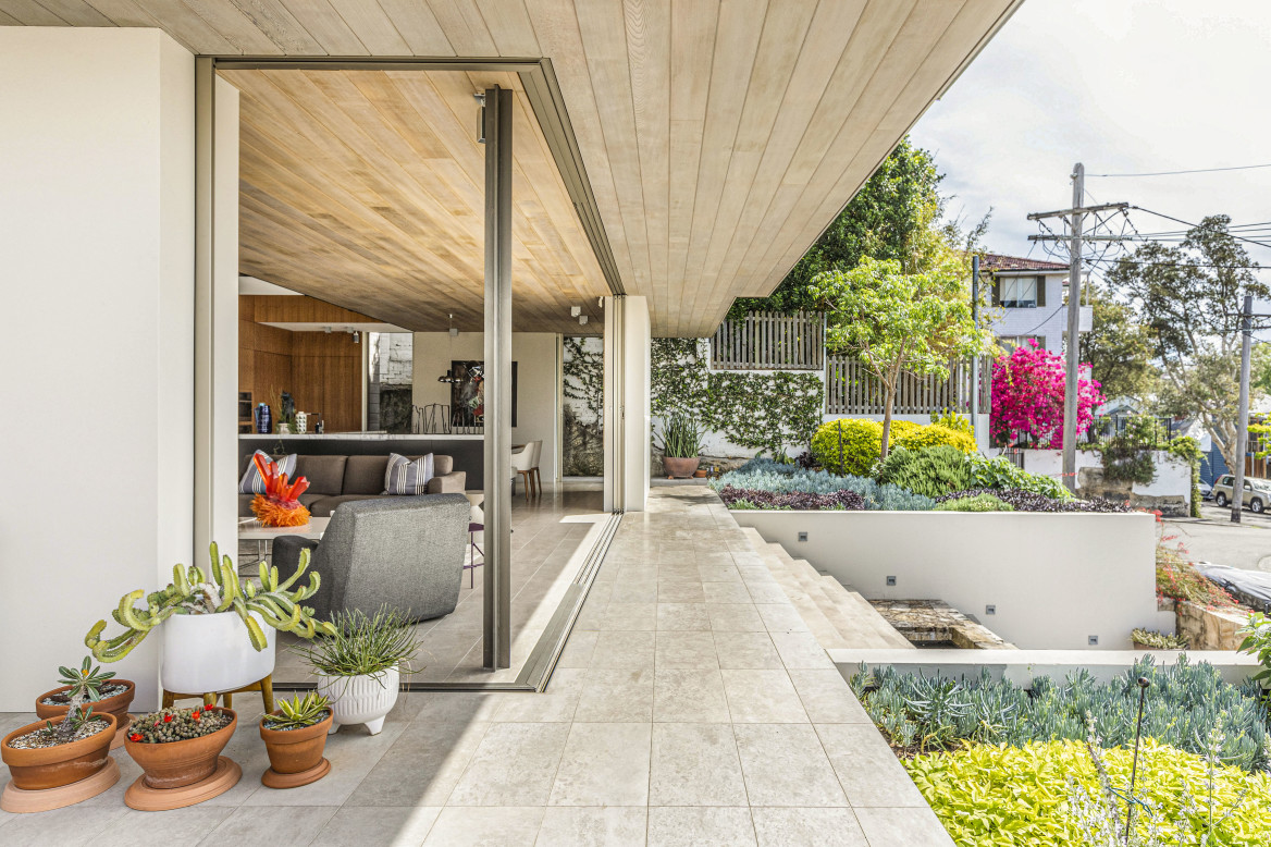
Both living rooms have been deliberately sized so that the furniture groupings can float in the middle of the room. This creates a sense of luxurious space. In the ground floor living area, this feeling is further enhanced when all of the doors are open and hidden in the wall pockets. The disappearing doors make the ground floor feel enormous and strengthens the notion that you are living in a ‘pavilion’.

“We have had a party of over 100 people and it didn’t feel crowded,” Silvius says.
“Over the years we have had many long lunches and evenings enjoying good food, wine, and company at the dining table and banquette. The square table facilitates good conversation and the banquette is generous enough to seat 10. We originally planned for an outdoor dining table but found that the indoor table is hard to beat. With all the doors open, you get the best of both worlds. You feel like you are outside, but you are protected from the elements.
“We have favourite areas in the house depending on the time of day. We tend to use the ground floor living spaces during the morning and afternoon. With all the doors open, it feels like you are sitting in the garden. The deep overhangs keep the sun out and with the prevailing breeze from the harbour keeps the room cool. There is a visual connection to Clayton Street, but the elevated position of the house provides enough privacy so you don’t feel spied upon. Wherever you are on the ground floor, there is always a pleasant view looking outwards.
“You can look at similar designs in architecture magazines and think they look like a museum. This feels like a home, while also proudly wearing its design intent.”
View the listing here.
