Home styling: art vs artificial
A home that conveys emotion will always entice more passion than the visibly staged space.
Owners style homes to add dollar-value or to personalise their own space to taste. But when staging for sale becomes too disconnected from that personal warmth, the emotion of a home is lost.
These are two different design contemplations, but the best results are achieved on both levels with less positioning of furniture and more storytelling…‘what is it like to live there?’
Starting in style
If you want to reinvent your space or prepare it for display, draw on your property’s qualities. Hone in on the elements that bring it to life.

Step back and don’t rush it. Buying a whole new look is sure to seem staged. And no amount of well-placed coffee table magazines will cover that up.
Instead, build around something you own and love. Professional stylists use this same approach for decorating clients’ own homes.
Your outcome could exude a sense of lived-in warmth not found in the phony property around the corner.
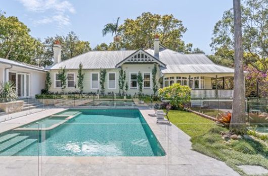
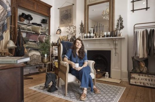
Need proof? All of the homes pictured in this article were marketed for sale/lease with nothing staged. All occupied, styling happened courtesy of the tenants.
It made sense to let these homes speak for themselves. Furnishings personalise space you can’t change. And tenants are the unofficial experts there.
Sydney expression
Once trapped trying to re-create Paris or New York, Sydneysiders have developed a style of their own.

Home styling goes back to the design fundamentals of colour, space and light. That’s right. Colour. It almost goes against the ‘keep it neutral’ scaremongering of property textbooks.
Urban Style Lab owner Mia Cipolla says Inner-city dwellers have smashed the formulaic to embrace particularly urban ideas. Rather than follow the ‘ trend’, they’re channeling a self-expression of the exterior environment.
“They’re adopting a style from outside their homes and bringing that in around them,” Mia says. “You draw the outside in with colour so there’s a natural correlation between the two spaces.”

It’s when sellers forget to preserve the individuality and character of their environments that styling can appear overly staged.
“You’re dealing with intelligent buyers and renters, and they have to start to imagine themselves to be there.” Mia says. “They’re looking to feel that connection, so they want to see personality.”
Where to now?
Plenty of style ideals work for personal spaces and those being prepared for sale. Mia has a few tips worth considering for both paths.
Detach yourself: Sure, there’s some detachment that needs to occur for mass appeal and marketing. “But it’s really important to not depersonalise a space too far. Remember to present the feeling that comes with living there.”
Search online: “Get a feel for what you like in stores or just do a broad search of your favourite styles before diving into a specific look.”
Basic design principles: “Consider space, proportion, light and scale. Then it’s the decoration and colour that actually glues a home together.”
One classic piece: “I’m a great believer of investing in classic pieces. You don’t have to have a big budget to create a great look. I know people who trawl the streets and find great pieces of furniture.”

If you know what you love about your property, evoking its true emotion could be an easy process. Even agents agree, ‘don’t sell the home, sell the dream’.
And dreams are colourful, electric and individual.


