Home Series: Chloe & Adrian Oddi
Balmain agent and BresicWhitney director Adrian Oddi has had success with his own renovations in the past, but nothing compares to this latest project, his current family home.
Only this time, everything was managed by his wife and interior designer, Chloe Matters.
“You realise once you look at everything through a designer’s lens that you’re not even in the same league,” Adrian laughs. “It’s made me see everything differently and I’m always discovering new favourite aspects of the home.”

The couple live in the Inner Sydney semi with their two young children, Oscar and Mimi. A Federation house, it’s been extended and renovated to become a four-bedroom contemporary home with three bathrooms and two living spaces.
Inspired by their own wedding in Puglia, Chloe wasn’t content with borrowing from Italian themes. Rather, she’s recreated them. In some whitewashed town on a Mediterranean coastline, it’s not unimaginable that you might peer past an open gateway and private courtyard, and arrive here.
The extensive use of rendered finishes is a nod to the Trulli buildings of Alberobello, where traditional conical roofs punctuate the sky in stony unison, the muted colours of the local foliage peering over high walls. This Sydney courtyard does its best impersonation with silver tones of cacti, olive trees and cascading dichondra in harmony.
Layers continue the drama throughout the space in a deliberate sense of theatre that ensures the home feels more exotic (and expensive) than it is.

“It’s all about playing with your perceptions,” Chloe says. “Tactility, touch and feel.”
“Approaching form and functionality with a little creativity, and using what’s already available, you can make something look more luxurious than cookie-cutter designs, and do it on a budget.
“I get a little kick out of that.”

A lot of attention went into understanding the layout and space before work ever began with builder Sutton Built. The hallway cabinetry and storage are finished with signature curves that tie in with the Federation bones. Quarter-sphere wall sconces coax visitors into the heart of the home, while also tricking the eye into thinking they’re part of the artisan plaster work.

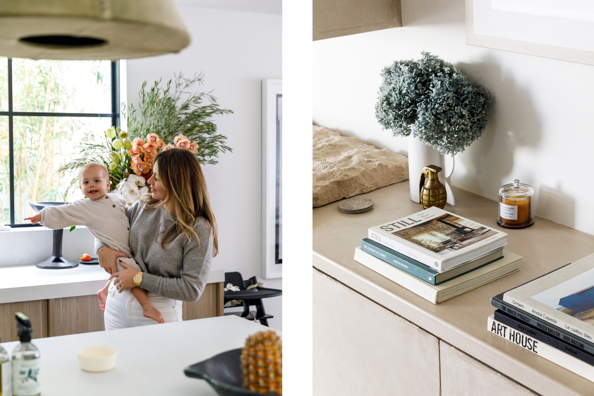
Downstairs, the kitchen/living/dining area is fused into one space, with everything having a clean line that draws your gaze outside to the real focal point – the poolside courtyard. With a fence thrown up inside the neighbouring border, Chloe was able to save funds on replacing the fence line, while adding to that Puglia villa expression. These lightweight foam panels – the type you might find in modern second-storey builds – are rendered with a dimpled effect that feels suitably old worldly.
With joinery from Javier Favaro from Ispace Solutions, the kitchen was designed to be generously relative to the size of this (growing) family. An important aspect for a house of this size, it’s embellished with space-saving ideas and affordable function: push-to-open storage space, drawers in place of cupboards, stowage that’s accessible from above, from front to the depths of the back.
Of course, with project of this level of consideration, some wriggle room was left for on-the-fly design manoeuvring.

When the herringbone crosshatching and original beams were discovered under the living room ceilings, they became an important detail, now exposed and celebrated. The same went for an existing roof cavity space, found to be larger than expected. It now houses a 7m-long walk-in robe with it’s own sense of wow. It’s perhaps a little less Puglia and a little more Milan back there.
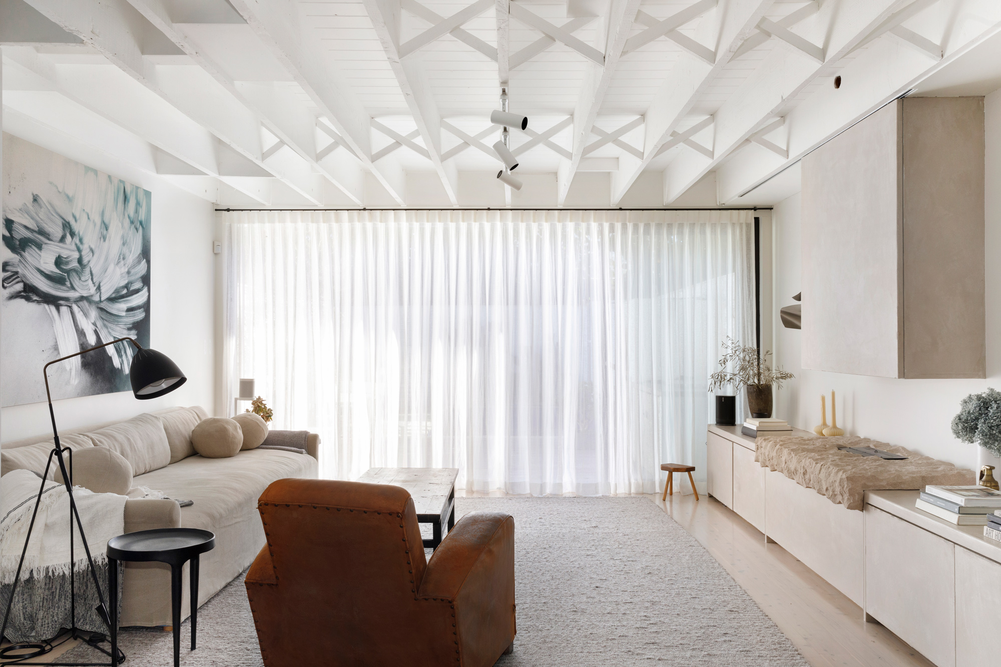
“You’re always thinking about resale down the track but that doesn’t mean you can’t be doing something different to everything else that people might see,” Chloe says. “That’s captured by knowing how to pull everything together.
“I think we’ve achieved it naturally, with materiality that doesn’t look uniform.”


