A view to forget
Guest writer and designer Katrina Malyn runs a local design firm, Design Projector, and specialises in creating houses with a view – even if there is no view. When she’s not working on building and design projects, Katrina guest writes articles about design for leading newspapers, blogs and magazines. Here, Katrina dissects a very specific design element in an architecturally redesigned Darlinghurst terrace, at 33 Surrey Street.
In urban Darlinghurst, charming terrace houses often have an outlook that threatens to spoil the visual harmony.
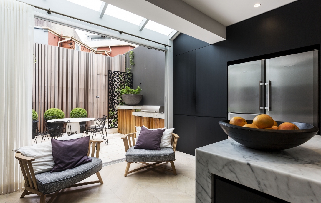
So what do you do if your courtyard faces the back walls of a commercial property? Landscape architect Melissa Wilson and interior designer Tonka Andjelkovic have one brilliant solution: create a new view that is strong enough to divert your attention.
Large surfaces of peeling paintwork on adjoining buildings can be an anchor for the eye. However, there is something more powerful – rhythm.
Rhythm can be defined as a regular recurrence of pattern in time. Our brain is trained to pick up the rhythm, because it is one of the underlying principles of our life: before we are born, rhythm is the first thing we hear in our mother’s heartbeat.
We can also visually perceive rhythm when our eye traces a pattern, creating a sense of movement and time. The beat in this case is sensed by the eyes, not ears. Rhythm makes your eye travel and adds interest.
In this little courtyard there are three different rhythms.
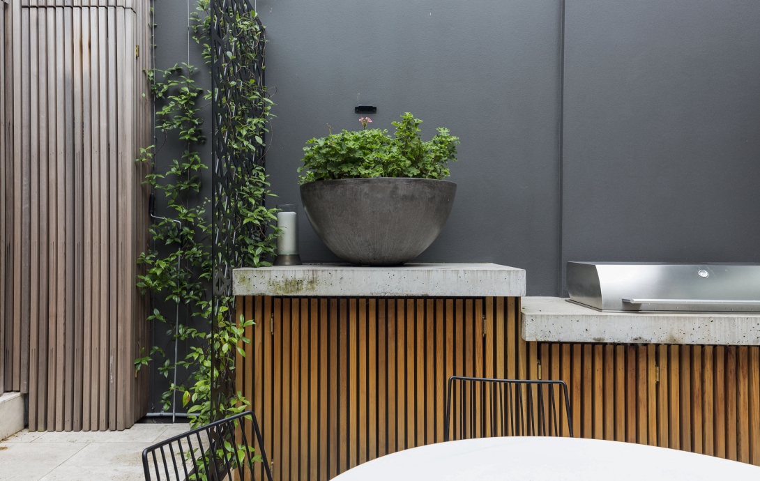
First, the linear rhythm of timber slats covering the roller door and the outdoor kitchen. Secondly, there’s the pattern of the brick wall. And thirdly, we sense the pulse of the laser cut aluminium screen.
This triad keeps your eye so busy that you completely ignore what happens outside the courtyard.
There’s a skill in combining three different rhythms and avoiding visual mess. In this case, the designers made it work so well by keeping each rhythm on its own surface. Another reason it looks so balanced is thanks to the plain backdrop – the flat rendered wall and concrete of the planter box.
A third secret is the balance of volume: the big semispherical vase contrasts with the smaller timber slats and medium-sized screen pattern. This change of volume invites our eye to travel between these objects in the courtyard.
This combination of three different rhythms has created a strong, new view. The less-attractive neighbouring buildings are almost blurred from memory.
