Sydney by design – architects’ tour of Sydney
This international city is always flaunting something flashy but Sydney’s most exquisite beauty is a blend of old, new and timeless.
Over the years Sydney has unfolded in layers of harbour-side conservation, convict-era preservation and the industrial age. A growing sensitivity for fusing modern development has joined the mix. Sometimes we get it right. Sometimes that’s a fight.
We got three of our favourite Sydney architects together and delved into some inspirational spaces. From the unseen marvels to the clear miracles, there’s plenty more to behold.
Director at panovscott Architects Anita Panov sees Sydney’s best in the beauty of natural landscape blended with the density and excitement of the inner city.
That notion dancing on that edge, between the natural and the artificial, was foremost in these architects’ minds at a recent panovscott house called ‘Jac’. It celebrated careful transformation, inserting a new structure between two that already existed – a federation-era cottage, and a mesmerisingly sculptural jacaranda tree, predating the house.

In the public realm, Anita looks to the seaside for synchronicity in built environs and nature. Our landmarks are the anchor points in our city’s design. Marvels of their time, many are understandably never to be repeated.
“The Opera House by Jorn Utzon is so obviously an inspiration that it’s often overlooked,” Anita says. “It’s rightly our best and most brilliant building. Poised on its artificially augmented headland of precast pink granite, we marvel at this building, inside and out, from near and afar.
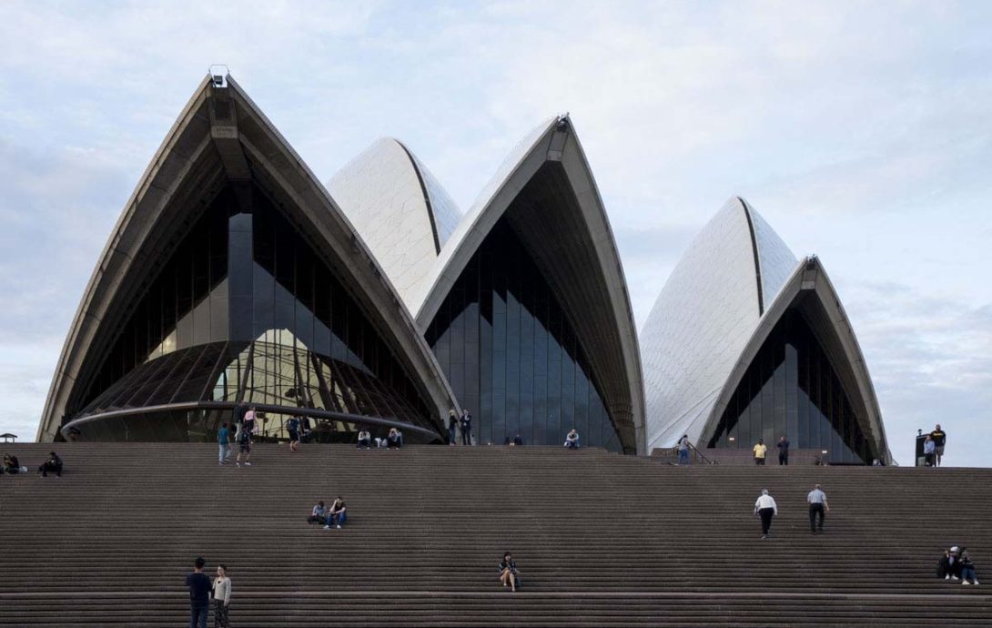
“It is a touchstone for design excellence – a process which involves clear aspiration, rigour, craftsmanship, and lots of hard work. It is not only an icon for the city but also an important gathering place, formally and informally. We feel buoyant, inspired during a visit into its halls. While outside, those shells shimmer in the sunlight and, at sea level, there is a richly coloured tidal band of seaweed and oysters like any of the walls which enclose our harbour.”
In nearby parts of town, more relaxing spaces inspire, from Andrew ‘Boy’ Charlton Pool by Lippman Partnership to Prince Alfred Park Pool by Neeson Murcutt Architects.
The Boy Charlton Pool mimics the natural and artificial rock pools which cling to our coastline. Its series of concrete bleachers follow the land’s edge – a spot to sit and watch the naval base buzz across the water, while the pool sits elevated above the water. In the change rooms, the rhythm of the harbour lapping on the shore echoes through the space.
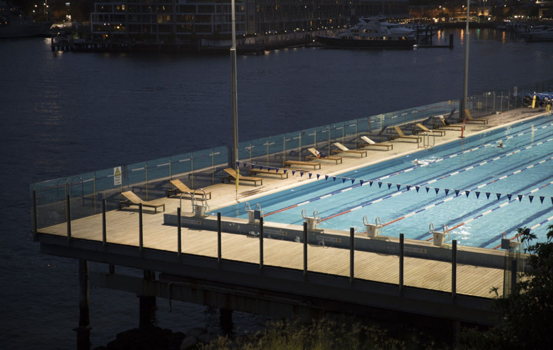
“Having been a place for bathing since the beginning of European settlement, the pool shows an acute awareness of site,” Anita says. “It plays perfectly to Sydney’s hedonistic lifestyle and there’s nothing better than a swim here to start the day.”
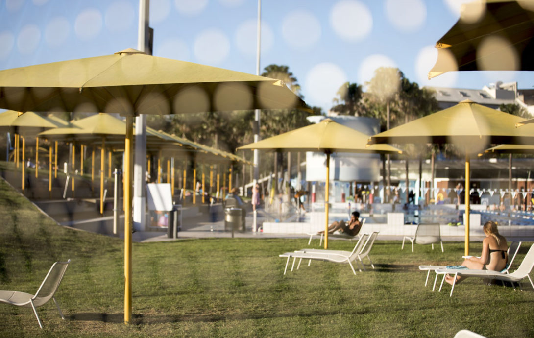
The Prince Alfred Park Pool brings the idea of rock pools, wharf pools and harbour beaches to the city, where there’s such a buzz we might not notice it. It’s semi-enclosed by landscaped hills, native grasses, and dotted with yellow umbrellas. The high-rise towers of our metropolis for the backdrop.
“This place manages to evoke simultaneously the beauty of our natural landscape, the joy of the communal act of the local pool, and the density and excitement of our inner city,” Anita says.
Architect Anthony Gill would agree. He’s known for rethinking the way we use city accommodation, from unlocking space in Paddington/Surry Hills terraces to exposing the potential of your favourite small bars and restaurants.
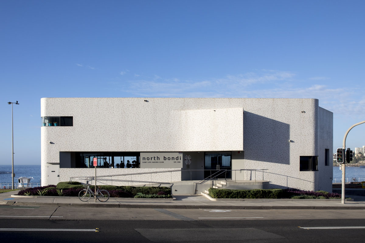
Yet each morning begins silently marveling at North Bondi Surf Live Saving Club. The curved structure from Durbach Block Jaggers Architects, with Peter Colquhoun, is a podium for watching life in the bay.
To wander the structure, it’s open and permeable, drawing your gaze through the building to the landscapes of the beach and urban scenes. On the beachfront, its curved eccentricity is everything recognisable and unfamiliar all at once.
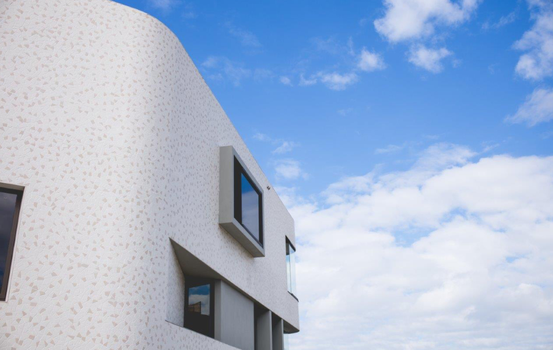
“What a challenging but amazing site,” Anthony says. “The building is beautiful from all sides and perfect for this location.”
Across town in The Rocks, the brutalist design of the Sirius building couldn’t be more different. But Anthony sees the Tao Gofers building as important in both design and home.
“This building made a great impression on me as a child and I would seek it out as we drove over the Harbour Bridge,” he says. “The NSW Government has moved all the residents out of the social housing and is selling the building. It’s likely to be knocked over.
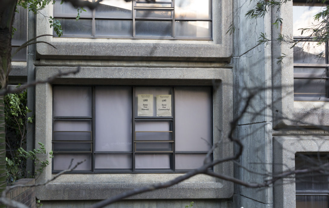
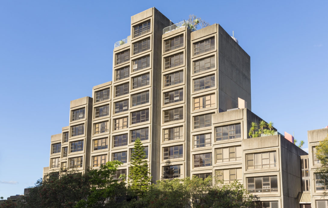
“It’s a beautiful brutal building and up until now it has ensured (with the other social housing in the area) a vibrant mix of residents in the heart of the city.
It was part of the ‘Green Ban’ movements in the ‘70s, and the heritage significance of this building has been ignored by the government.”
An outsider on Anthony’s list is a tucked-away bar in Paddington, 10 William St. “I think the owners designed it,” he says. “Maybe with some outside help.”
A terrace house converted into a restaurant, it’s the favourite bar of a cool wine scene in Sydney and is better known for its sharp service than its radical architecture or design. But it is beautiful in its simplicity and anonymity.
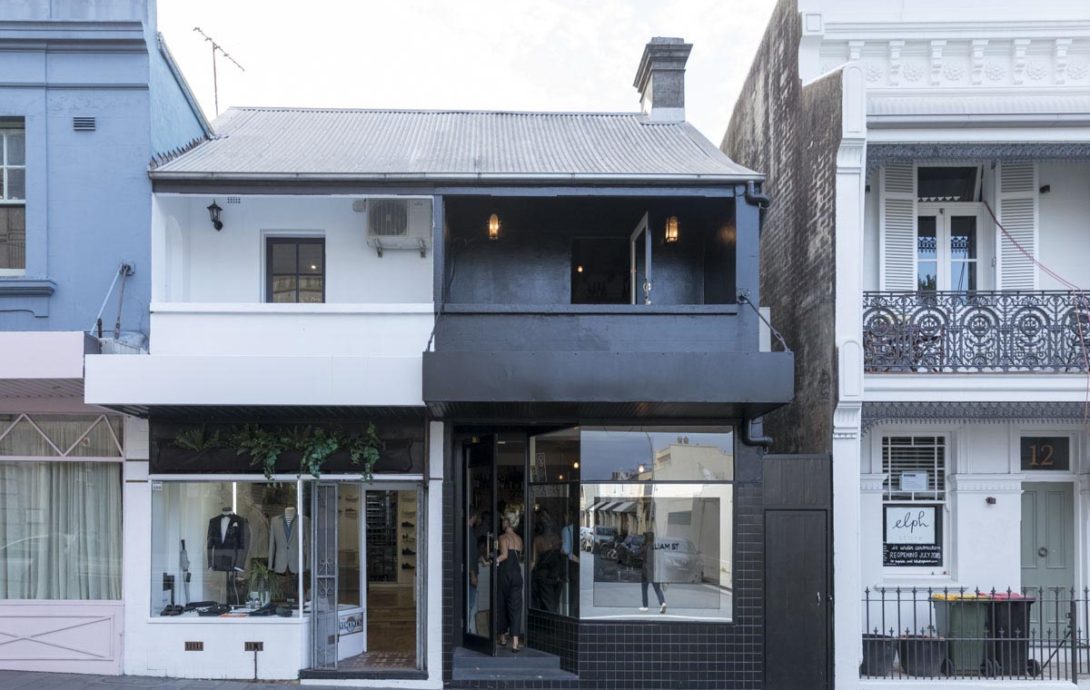
“It’s perfectly scaled and detailed, Anthony says. “It looks like it has always been there.”
Perhaps the White Bay Power Station at Rozelle possesses similar traits for Ian Moore. Now an abandoned site, The Ian Moore Architects director says the pure functional expression and scale of this building are powerful, speaking clearly of its original use.
“It’s a clear visual organisation of the disparate elements that go to make up a power station, the majestic central turbine hall, stepping down in scale to the smaller ancillary buildings with the externally expressed lightweight steel conveyor structure, clad in corrugated iron.
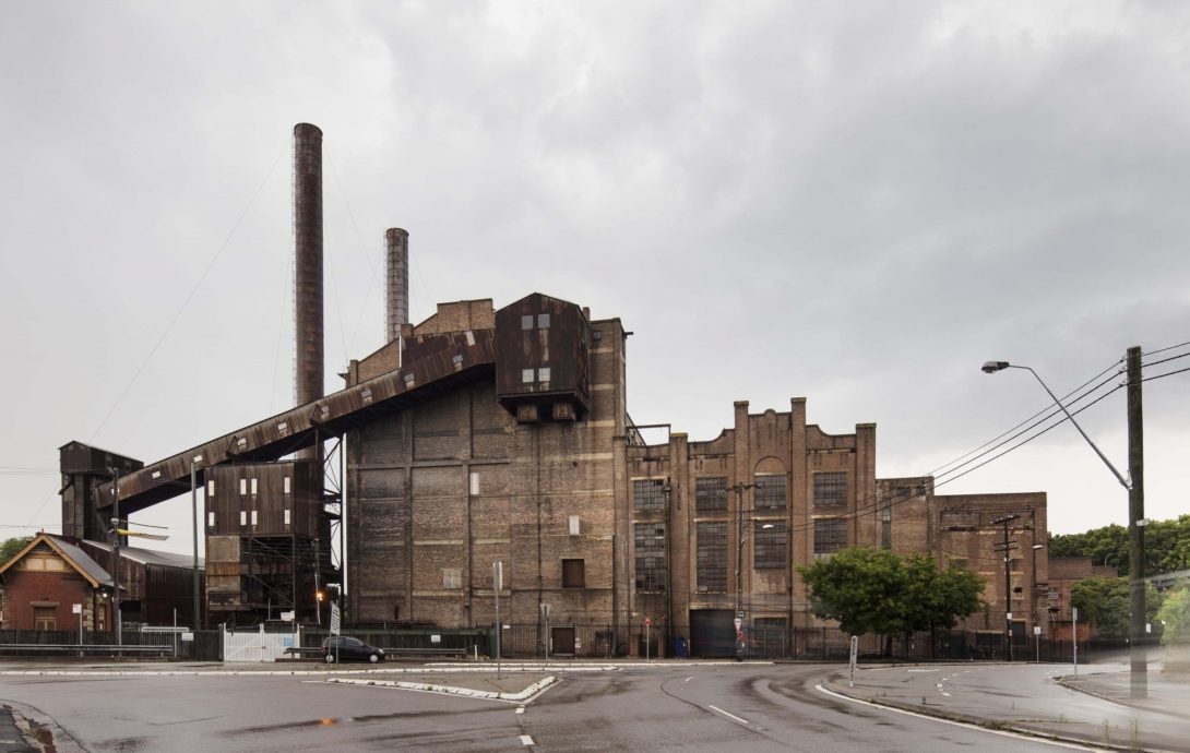
“I particularly love the juxtaposition of the delicate steel elements against the mass of the brick turbine hall. I certainly hope that all of these design elements are retained in any future adaptive reuse of the building.”
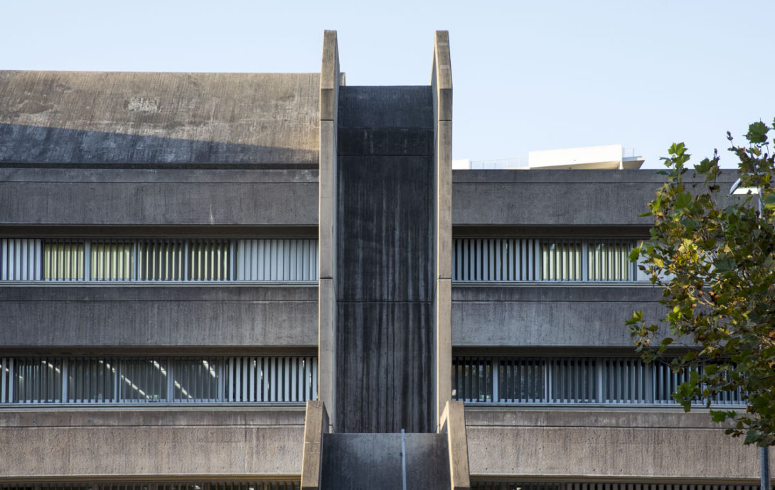
Ian’s other picks are just as utilitarian. Off-form concrete is an apartment block trend, but he tips the Sydney Police Centre in Surry Hills as being ‘one of of Sydney’s finest structures’ in this realm.
“A powerful statement about authority and security, it’s built to last out of a single material. However, the proportions of the building, the exceptional detail resolution, and the scale changes introduced in the pre-cast concrete sunshade blades allow this building to sit comfortably within the context of Surry Hills.”
If there’s elegance to be found in other government buildings, Wynyard’s Transport House is up there. Designed by the architects Henry E Budden and Mackey, it dates back to 1935 as home to NSW Railways. The green terracotta-tiled facade (the then official colour for NSW trains) is a backdrop to Wynyard Park.
“The asymmetrical facade with its northern tower and beautifully proportioned horizontal fenestration make this one of Sydney’s most elegant inter-war office buildings,” Ian says.
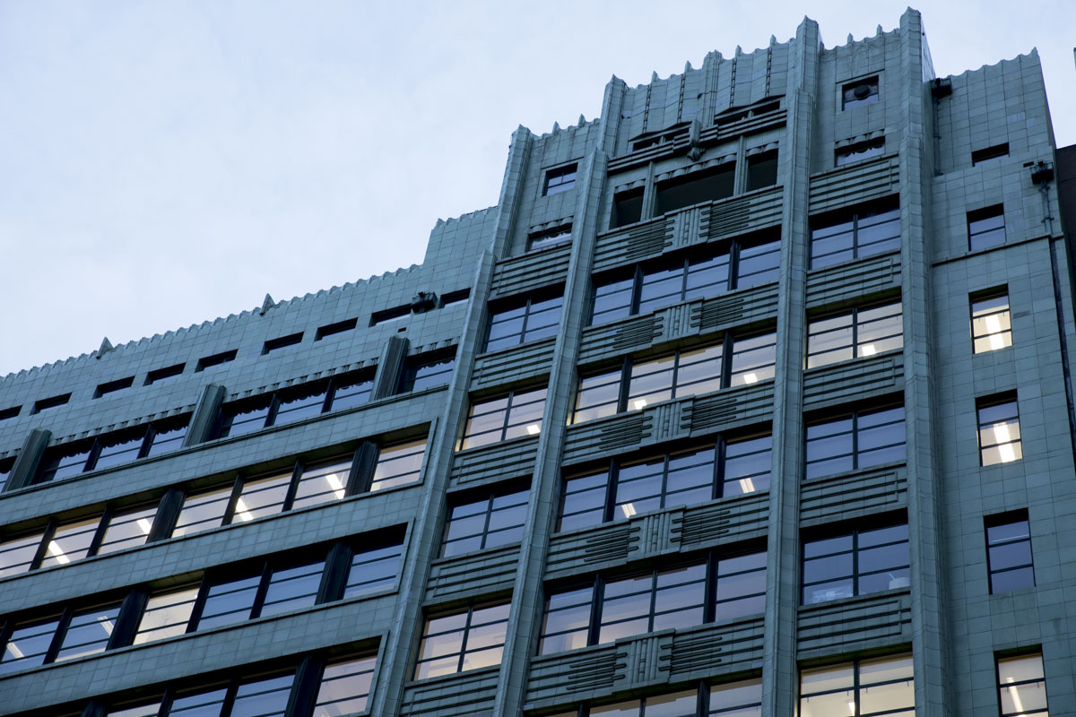
“The materials and detailing of the building have meant it has hardly aged and the green tile offers a stunning alternative to the standard use of sandstone for most public buildings of the time.”
With these wonders in mind, a wander through Sydney will unearth more for us if we look up, think outwardly, and keep open.
Thanks to these architects for the tour.
www.panovscott.com.au/
http://www.gillarchitects.com.au/
http://ianmoorearchitects.com/
