Architectural alchemy.
The first glimpse of the Lower North Shore office for BresicWhitney came with the caption, “Blue Skies Ahead”. It was an intentional nod to what the property group believes the space represents in more ways than one.
That was in June, when the design and construction by award-winning THOSE Architects was nearing completion, after an involved 12-month process.
Now, the ladders have come down, books and design objects fill the nooks, and the space hums with the motions of the every day. You’d be forgiven for thinking that it could have just been part of the landscape for years – or decades – as the building itself has.
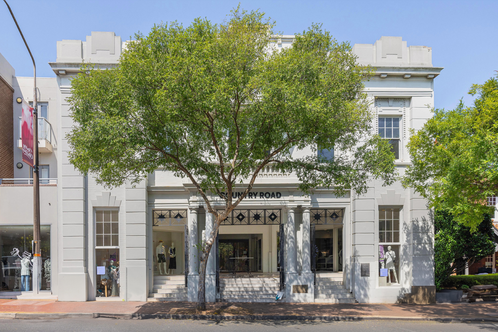
The new office is inside Mosman’s historic ANZAC Memorial Hall. Once a space where veterans would gather, the building has since seen iterations, from an antique dealer to a yoga studio.
Affectionally known by locals as the “Country Road” building (referring to the downstairs tenancy), BresicWhitney was drawn to the space as an opportunity to breathe new life into its four walls, while respecting its history. It’s a new visual chapter for the brand, and the building. One that BresicWhitney believes reflects not only its genuine commitment to its Lower North Shore presence, but its investment in creating enjoyable spaces for its people and its clients, while also signalling the group’s understanding of the values of the community.
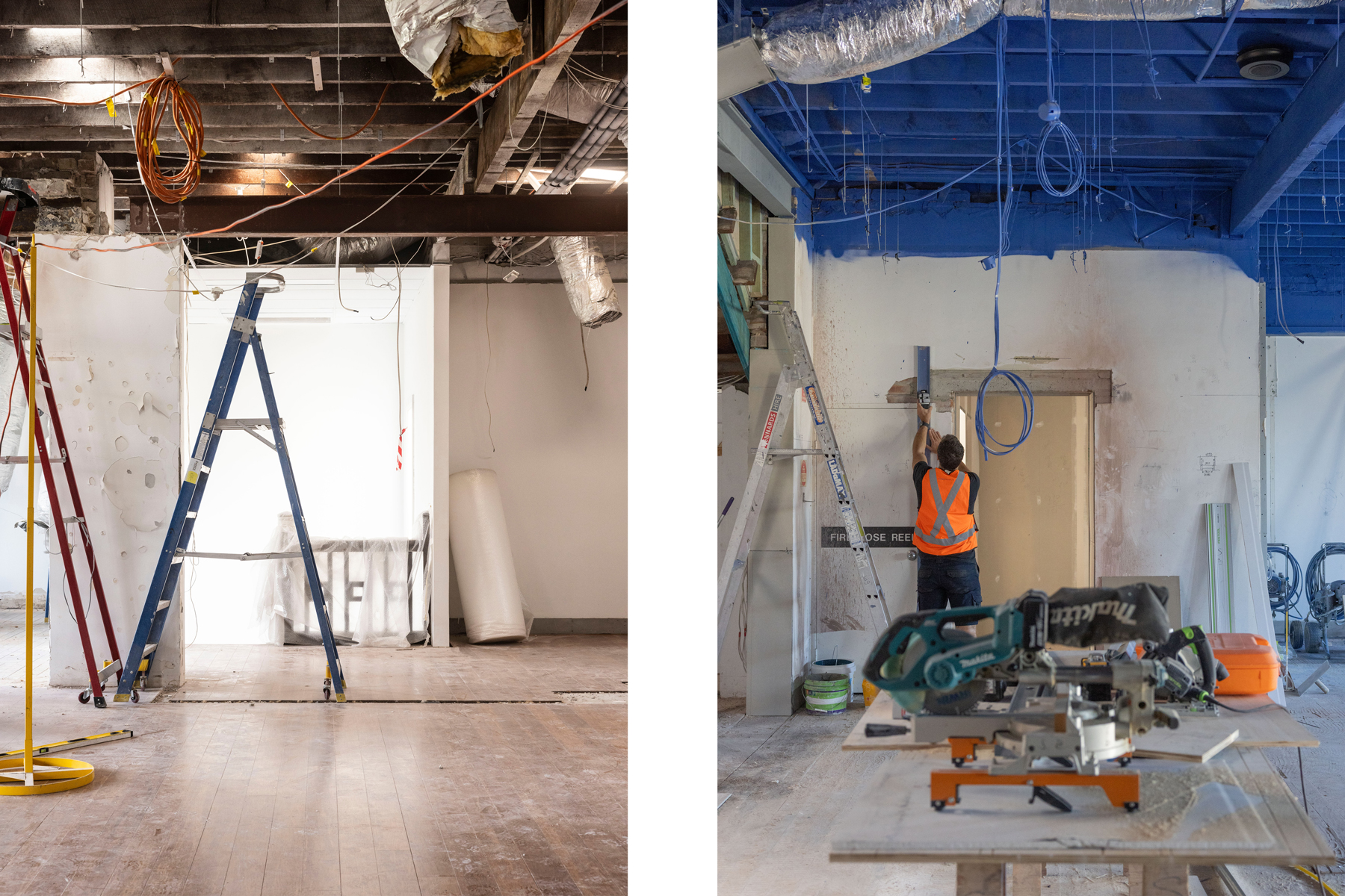

With the director and co-founder of THOSE, Ben Mitchell being a Mosman local, it was a predestined partnership between an architect and a property group who both share a vision for the unexpected.
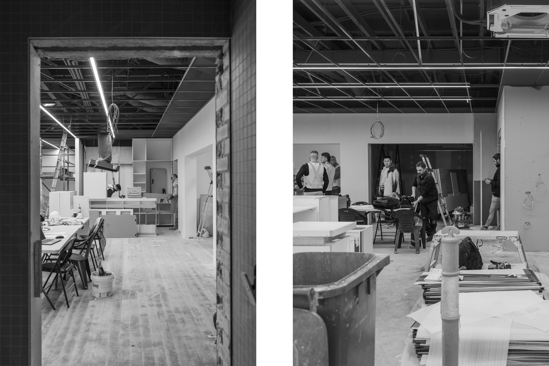
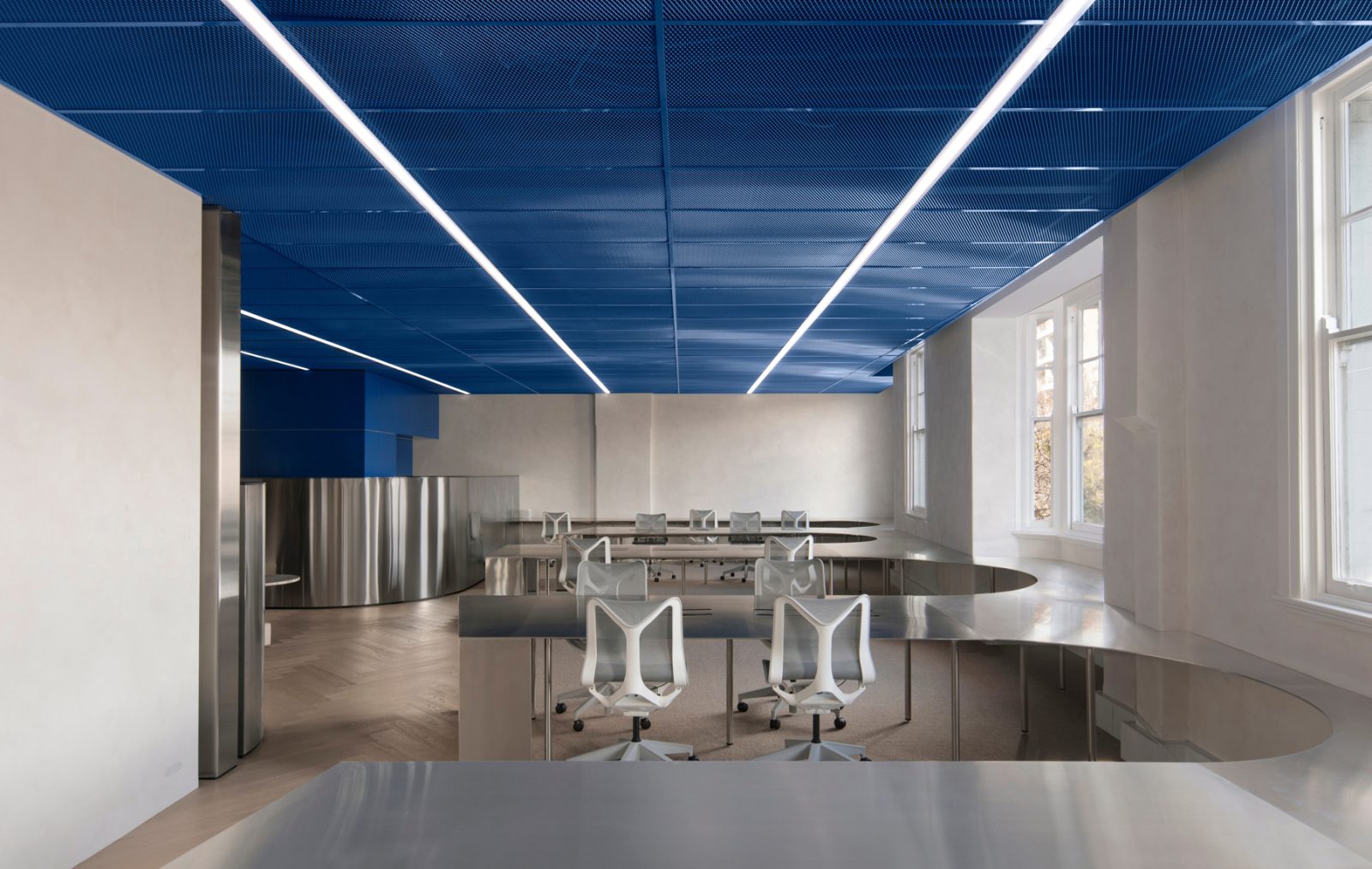
Just one of those is the French Blue steel mesh that lines the ceiling. It’s powerful presence is felt inside the space, but also from the street, with the mesh intentionally visible from the street. An unexpected feature that draws the eye upwards in both day and night, providing a curious glimpse at the offbeat material curation, and delivering on the literal meaning of the blue skies that are ahead.
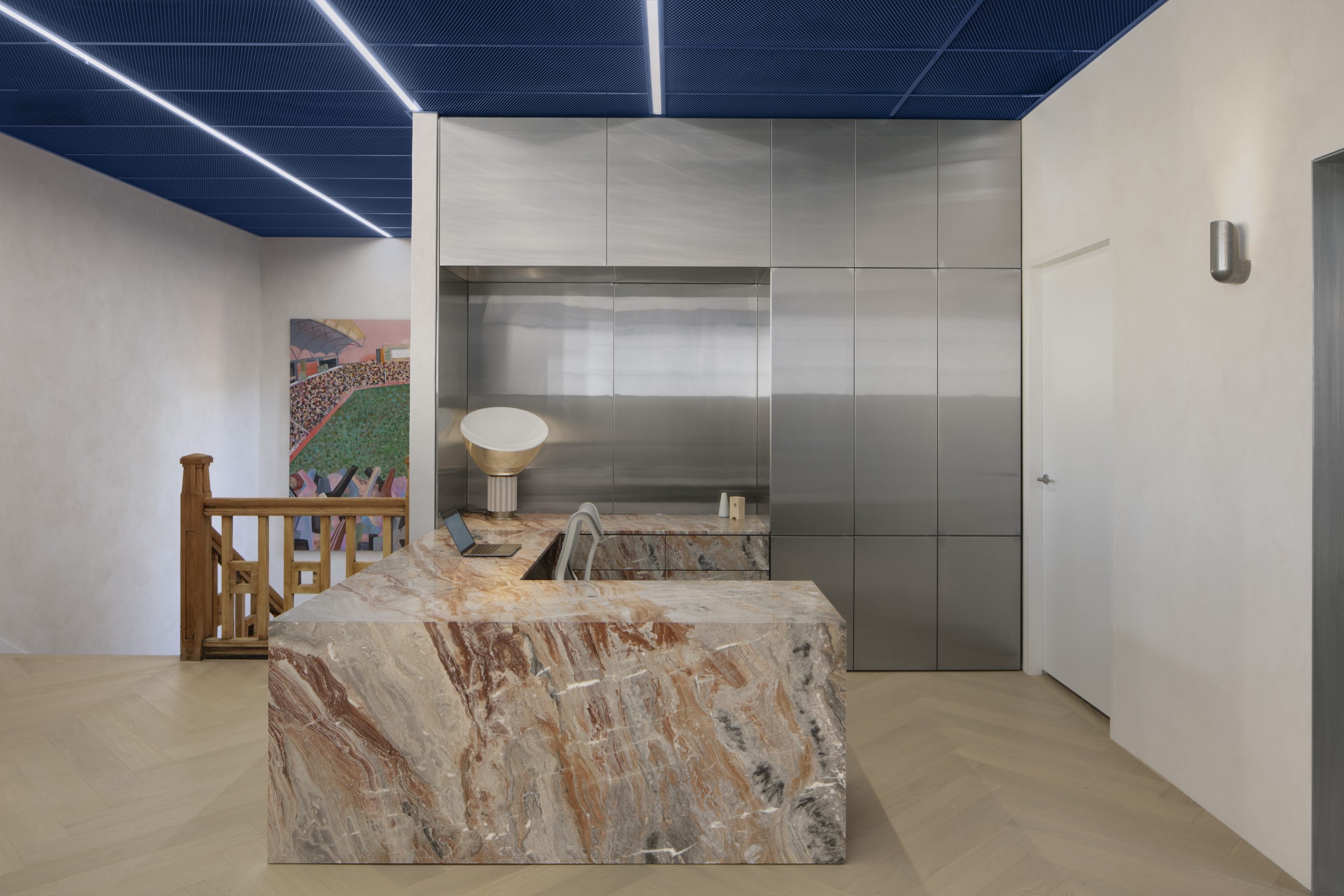
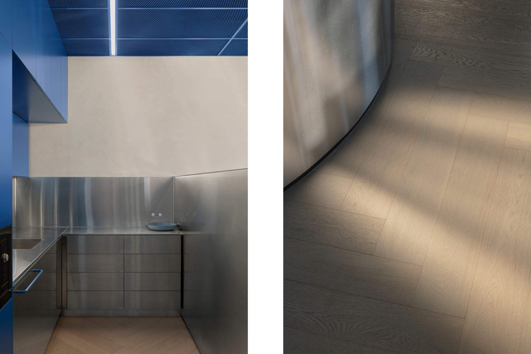
Each detail throughout the build was selected to provide a point of difference, to evoke the unexpected, and to do more with less. Austere stainless steel has been cut in way that bends and curves, melting into the bay windows. It’s contrasting with the original structure, yet playfully correlative.
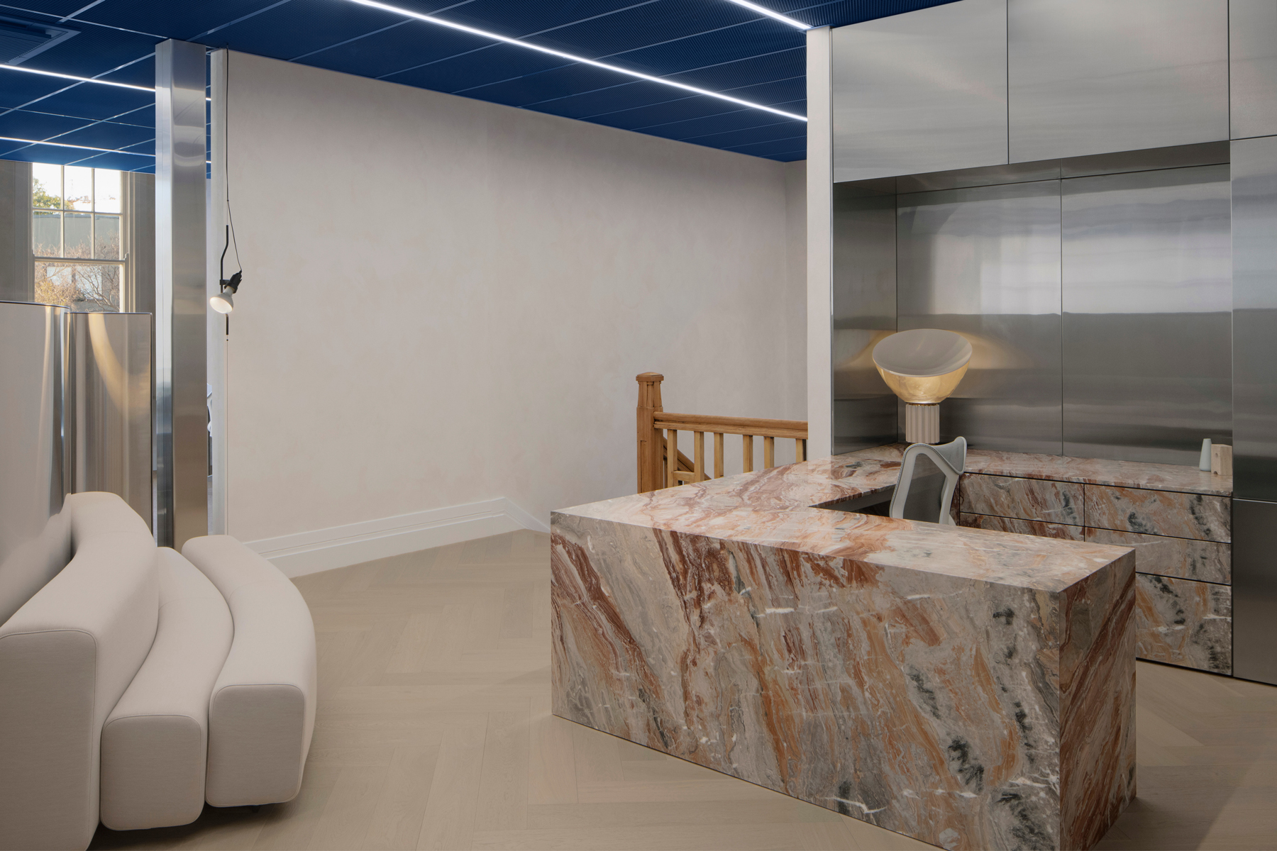
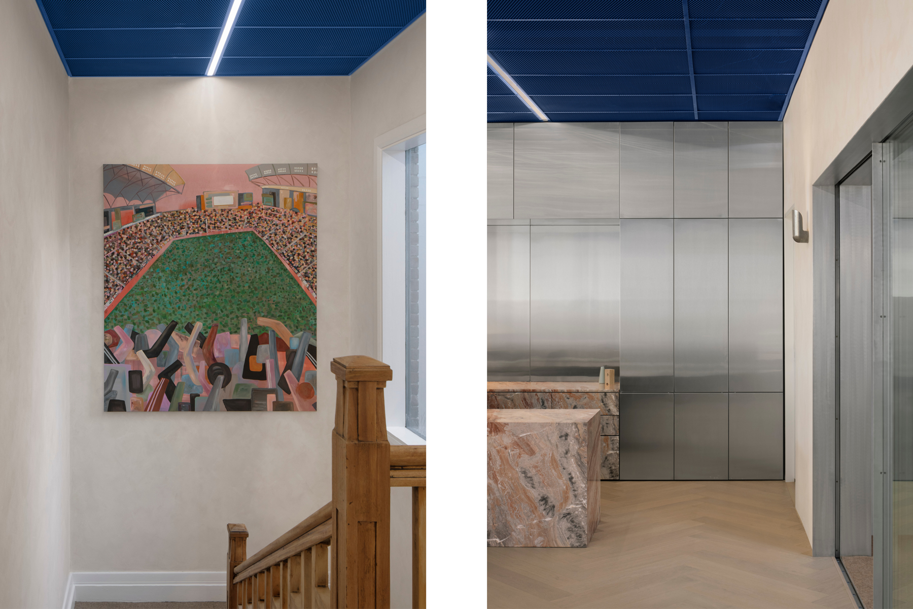
Tactile slab marble conceals drawers, while further stainless steel conceals cupboards and supplies. Beyond concierge, the meeting rooms and breakout spaces are beautifully appointed, designed to be both formal and informal.
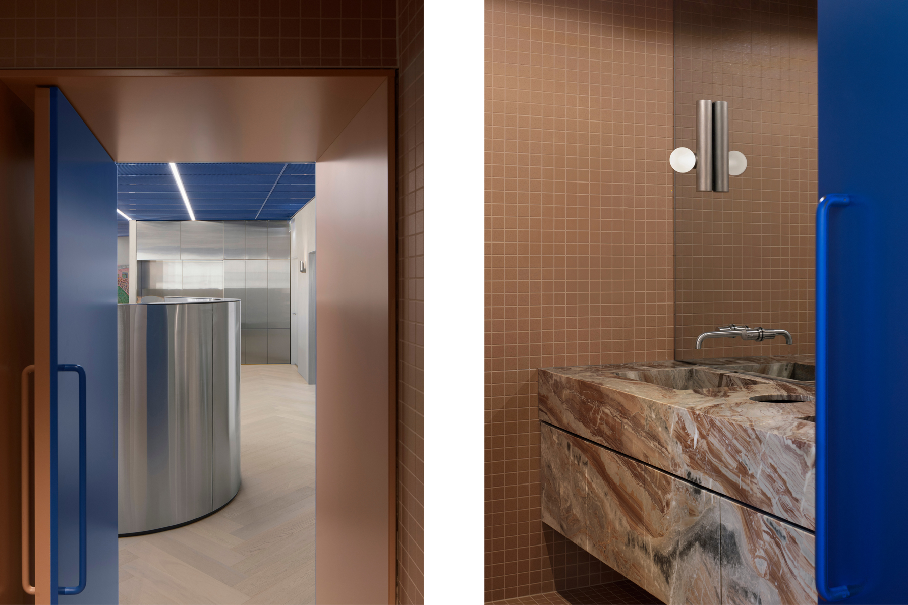
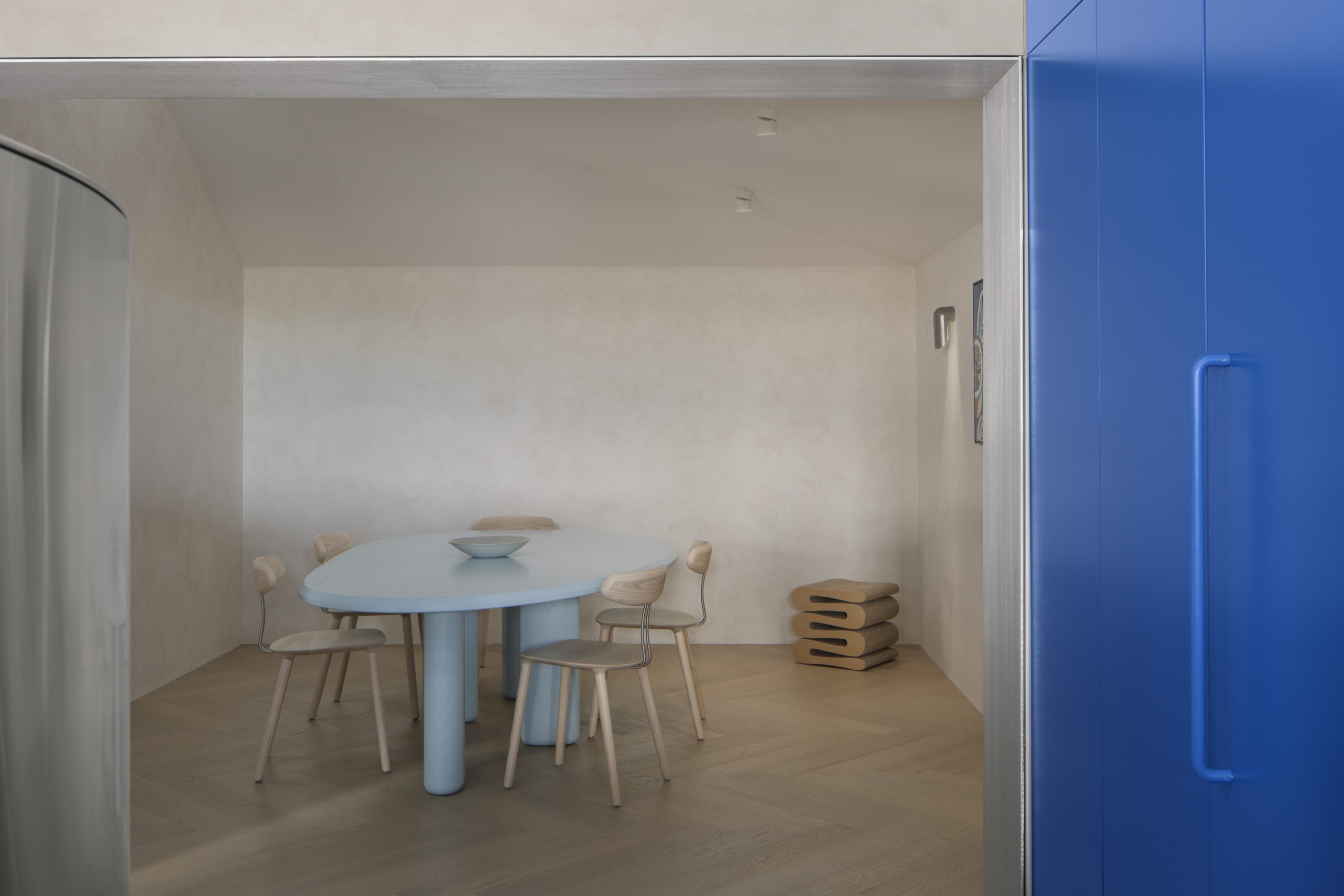
Tucked away behind a bank of unmissable French blue joinery is the kitchen, as elegantly finished as every other space. Informal seating zones with small marble-top tables and bench seating that hugs the steel serve as a counterpoint to the main workstation environment.
Delighting in the unexpected, it also serving as a functioning, working office, a robust amalgamation, artfully fashioned into a holistic experience. A place that can house BresicWhitney’s existing team, and accommodate planned future growth across sales, property management and operations.
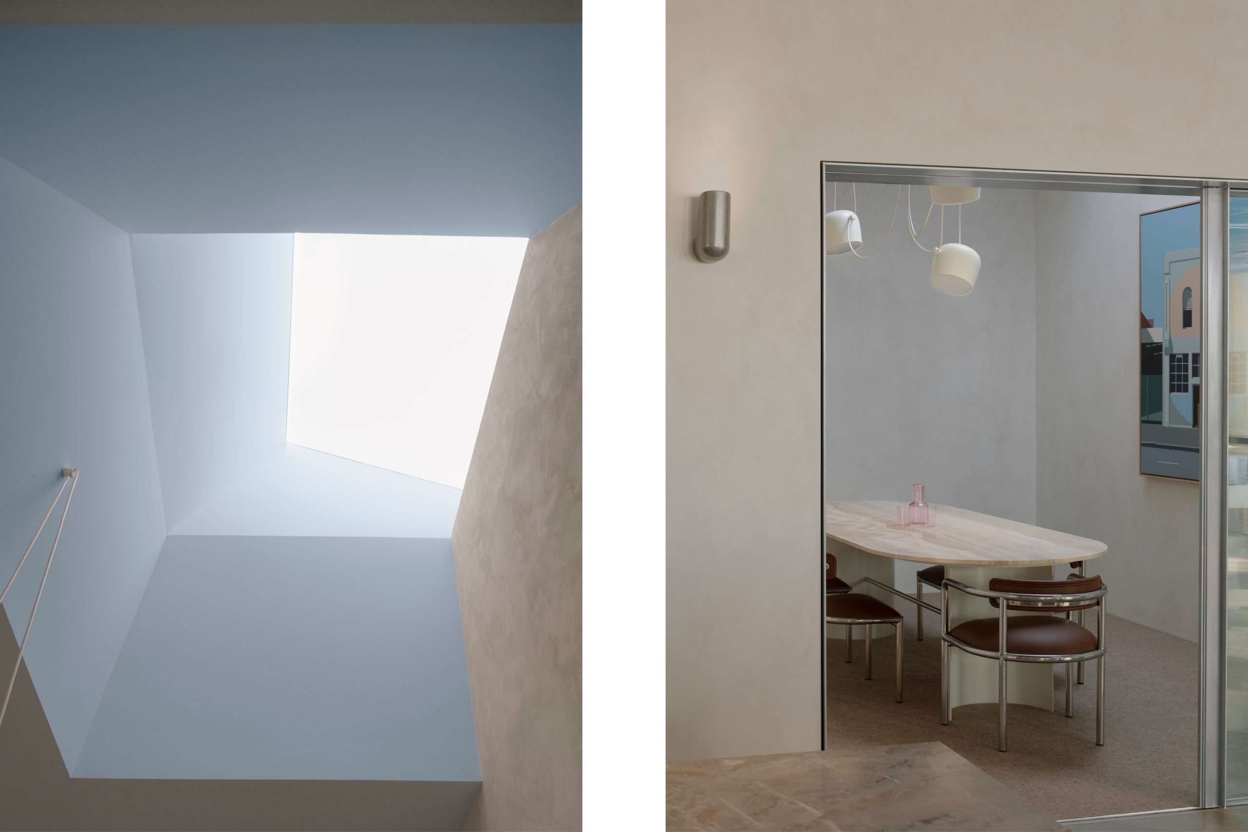
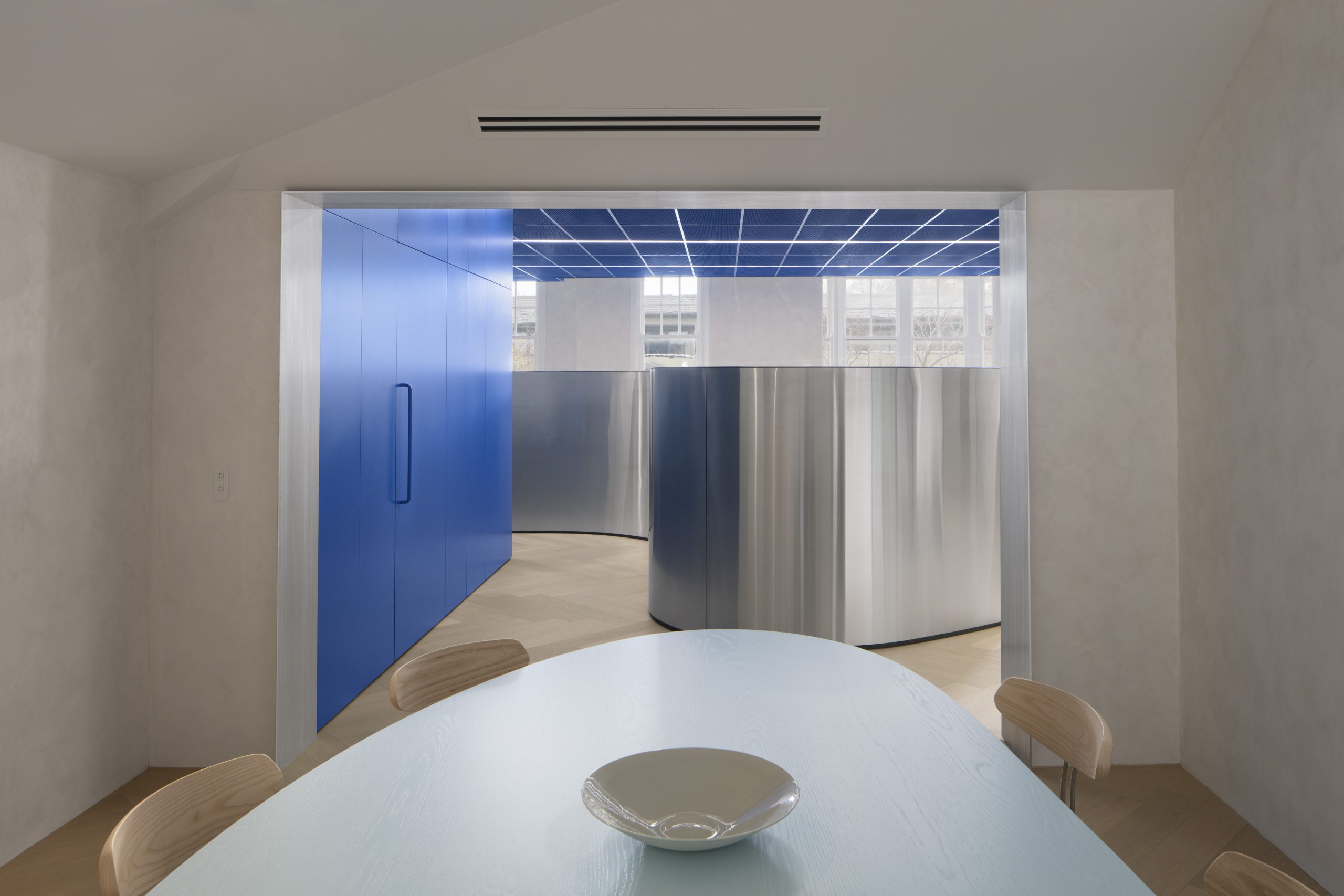
“An enormous amount of prototyping went towards the final result,” says Ben. “On a tight turnaround, ideas were tossed around, sketches made, prototypes whipped up, sent back and forth to the workshop, until all the major design components had been executed flawlessly.
“We challenged what might be expected of a sheet of stainless steel, marble or perforated mesh, while first thoroughly understanding what that material was capable of,” he shares. “[At THOSE] We are interested in the distillation of the complex, to achieve results that might in the end almost seem inevitable, at least to us and our clients,” Ben says.
In a city where inhabitants hug the CBD and harbour, BresicWhitney’s expansion into the Lower North Shore could too be described as complex, yet inevitable. ‘Complex’ due of the competitive real estate landscape in and around the local markets, and the strategy and planning that’s required for sustainable growth. Also complex in a more literal sense, with heritage constraints applied upon the building – such as the original space of the entry stairwell, that’s been painstakingly preserved to its original 1922 glory.
‘Inevitable’ to those both inside and outside BresicWhitney; completing the group’s u-shaped ring of brand presence around the Harbour. Its singularly owned model means BresicWhitney can service residents who move East to Inner West, East to North (and back), or between Balmain and Hunters Hill, just as it has done for the last 20 years.
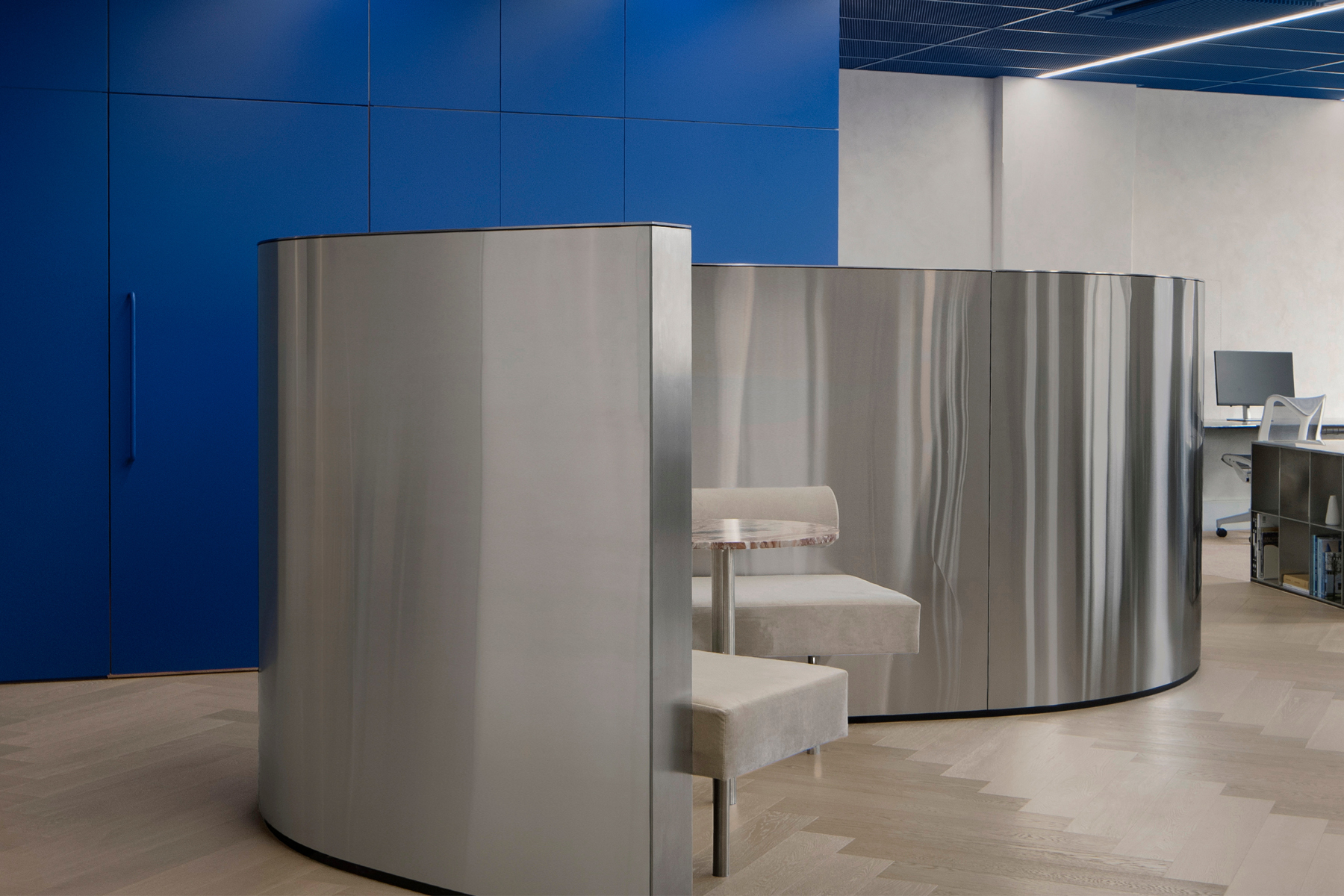
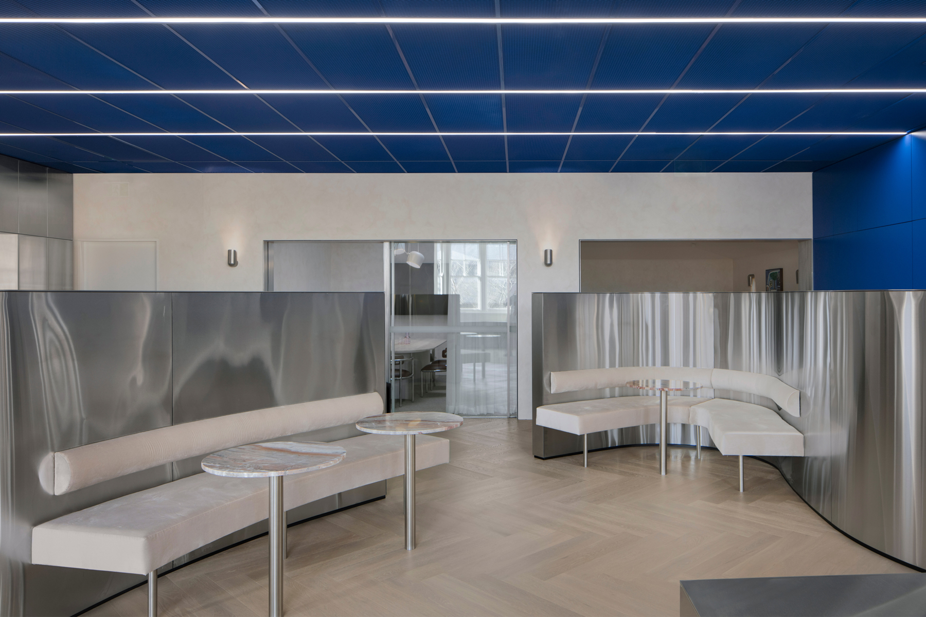
Movement that is also reflected in the design features of the office itself. The meandering metallic steel ribbons that make up the wall areas and workstations are a nod to the bays and curvaceous topography of the North Shore peninsulas.
As Ben shares, “Architecture can lift the spirit if the endeavour to look at things differently is there, followed through to the end, and most importantly, executed well. And through collective effort, we can achieve things that become greater than the sum of their parts.”
“The design is also a nod to the BresicWhitney way of doing things intentionally differently. Like that ethos, there is an honesty and an openness to this space, that hides nothing, and reveals everything.”
As a group, the architect-designed offices of BresicWhitney have long been a reflection of their neighbourhoods in the East, the Inner West, Balmain and Hunters Hill. While making a bold statement, each has its own fingerprint.
The unveiling of the Lower North Shore space does this again, in a way that’s masterfully accomplished and understatedly Sydney.
