Shiplap House: a fresh approach to a longstanding connection
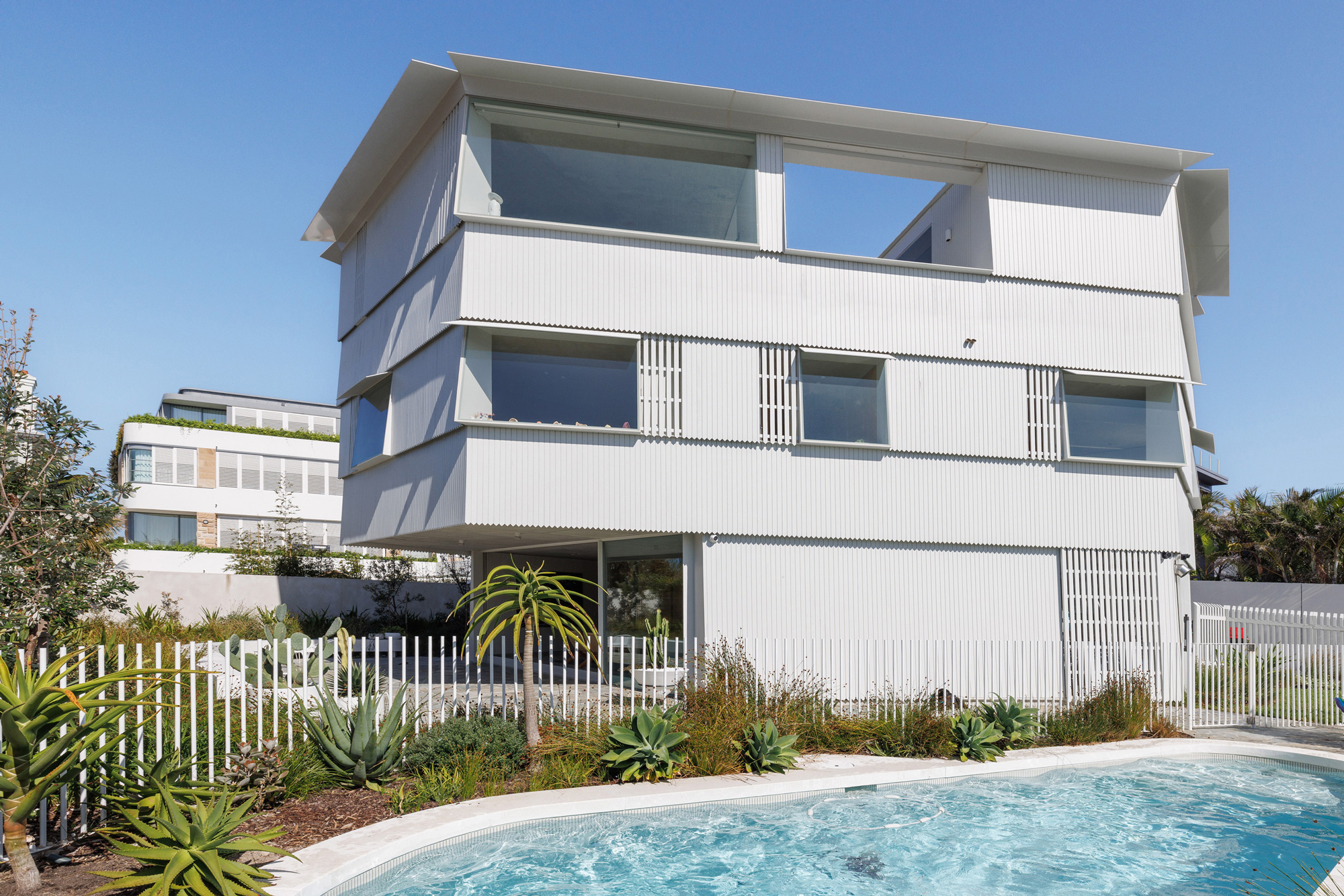
Shiplap House is the residence that appears as though it could have always been a part of the Vaucluse streetscape. Punctuating one of Sydney’s famous Eastern Suburbs’ ridge lines, it takes both passers-by and visitors back to a time of delicate weatherboard contours and coastal structures.
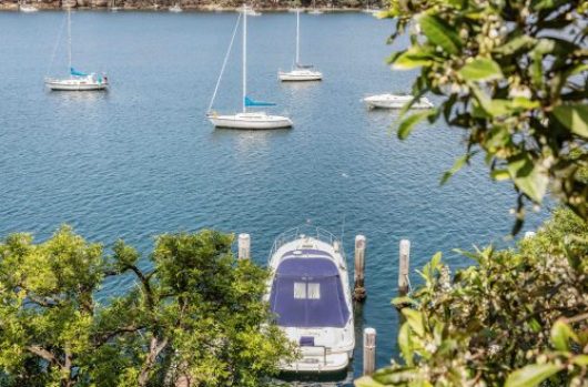
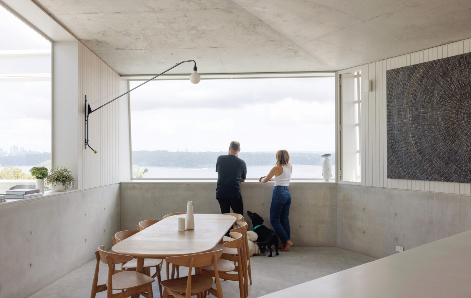
But as a 2023 design created for a growing family of five, the experience is anything but subtle. It provides a compelling vantage platform for the comings and goings of Sydney Harbour, the ocean breezes filling the home with intoxicating natural air and relaxing informality. It’s a refreshing sidestep from the more formidable built forms the area is perhaps more famous for today.
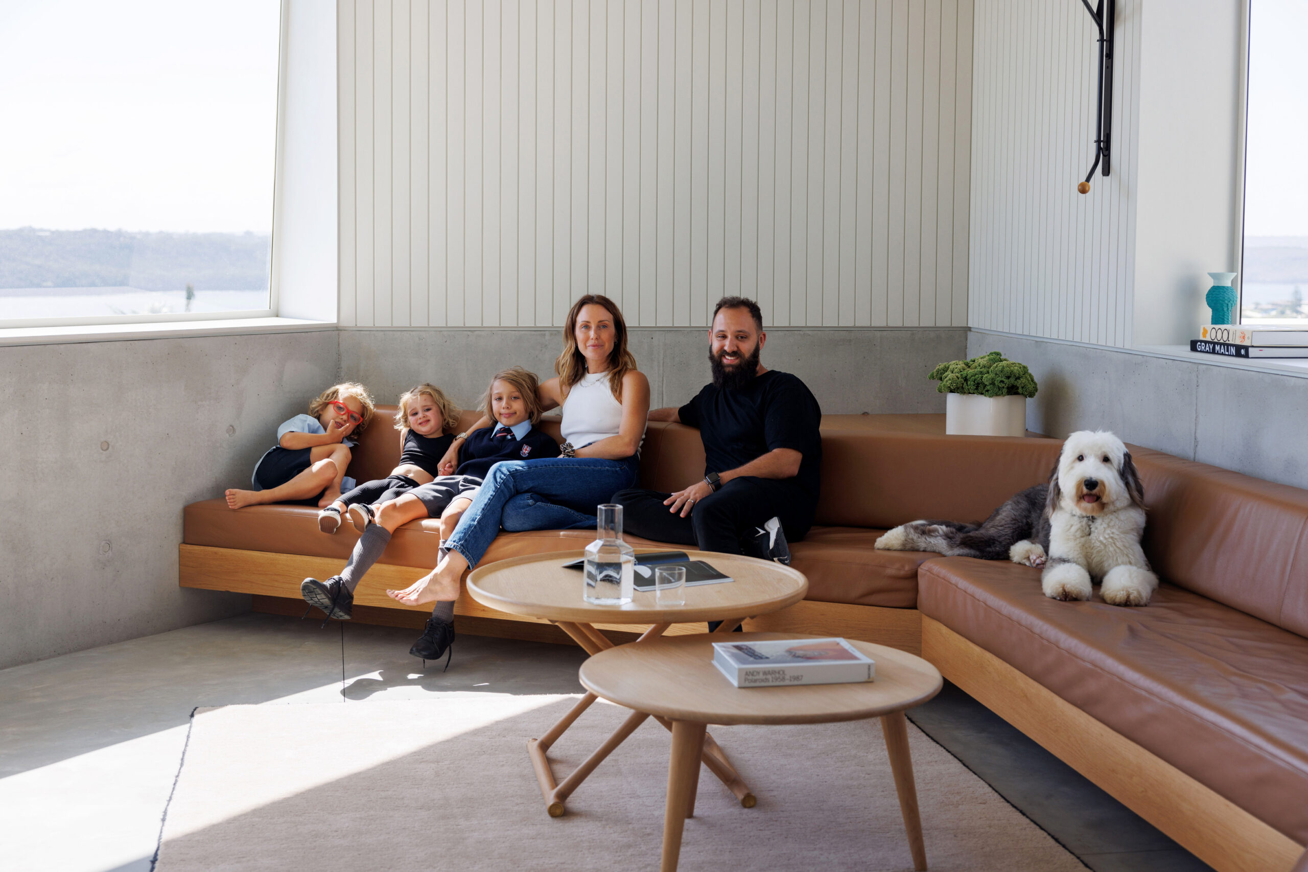
Like the seaside narrative the design draws upon, how it came to be has a history and a tale of its own. Owners Rick and Laura commissioned the award-winning design team off the back of Laura’s working relationship with Chenchow Little, a bond that spans many years and a number of projects.
Going back to 2012, Laura was point-of-contact for a conception that would see Chenchow Little create an ambitious workspace for BresicWhitney. With Laura working as assistant to founder Shannan Whitney at the time, the relationship with Chenchow Little evolved further as they embarked on similar projects for the property group’s presence across Sydney.
“I had a lot of contact with them over the past 10 years and when it came to us building our house, it was natural to talk to them, along with five or six other architects, before circling back to Chenchow Little,” Laura says. “Because, it just fit.”
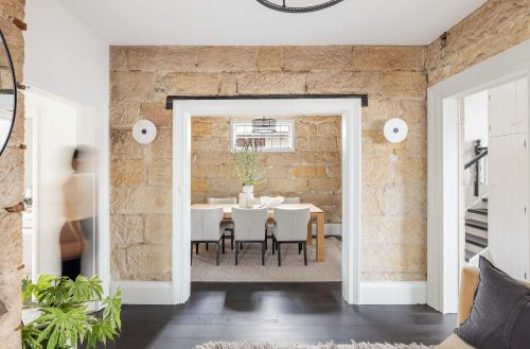
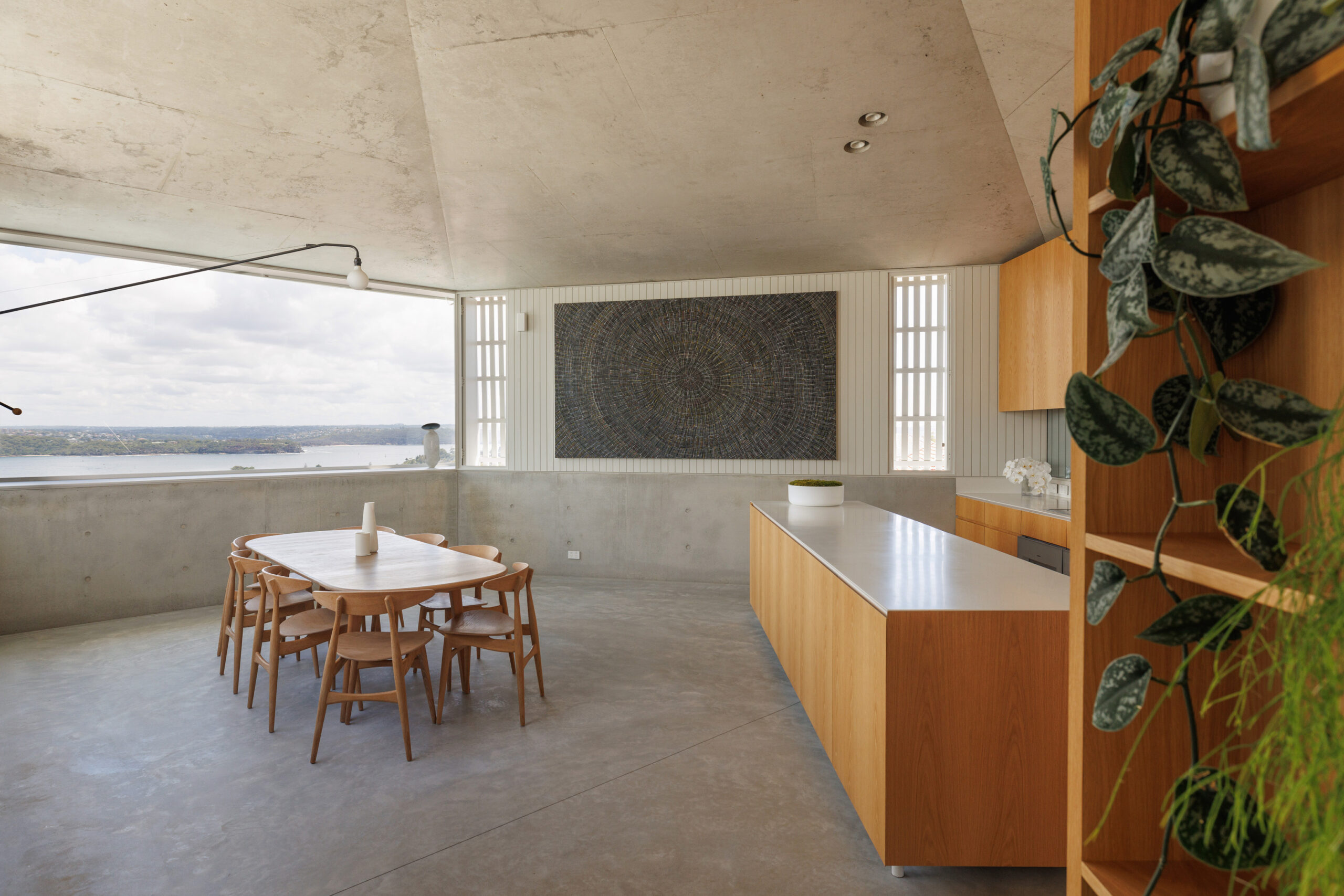
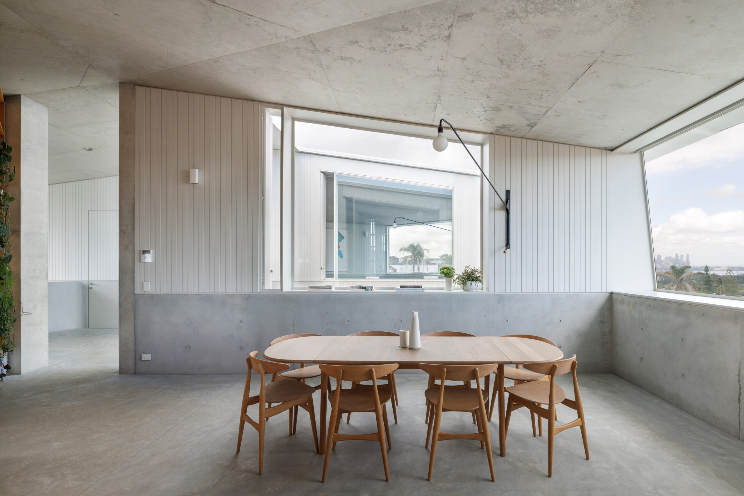
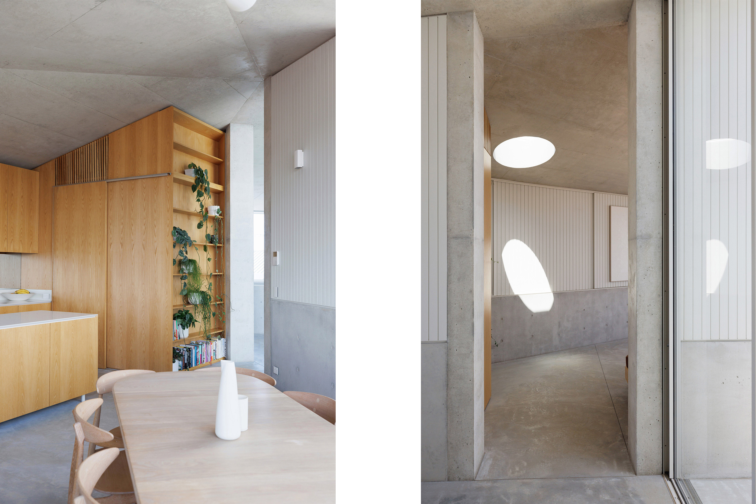
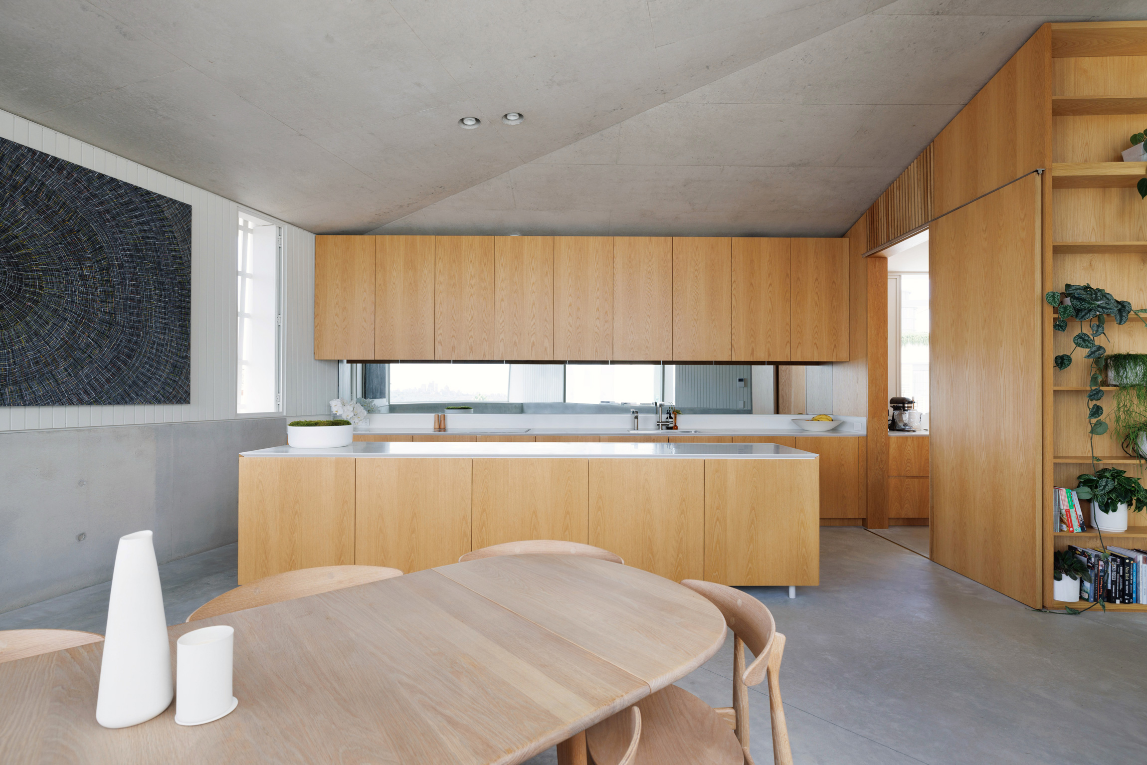
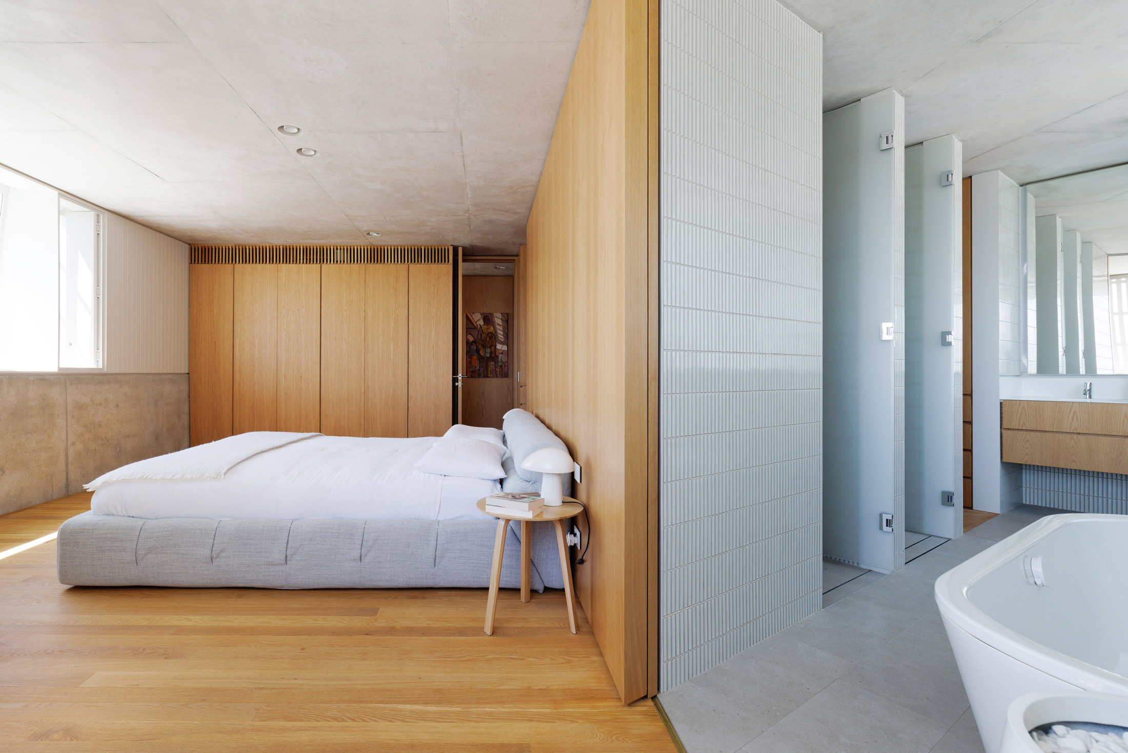
Perhaps coincidentally, Rick and Laura were both looking to incorporate the use of concrete and timber, something that features heavily in the BresicWhitney offices. The Darlinghurst space is known for its pavilions set within a concrete shell, while Hunters Hill is warmer with traditional hardwood detailing reflecting the heritage of its surrounds.
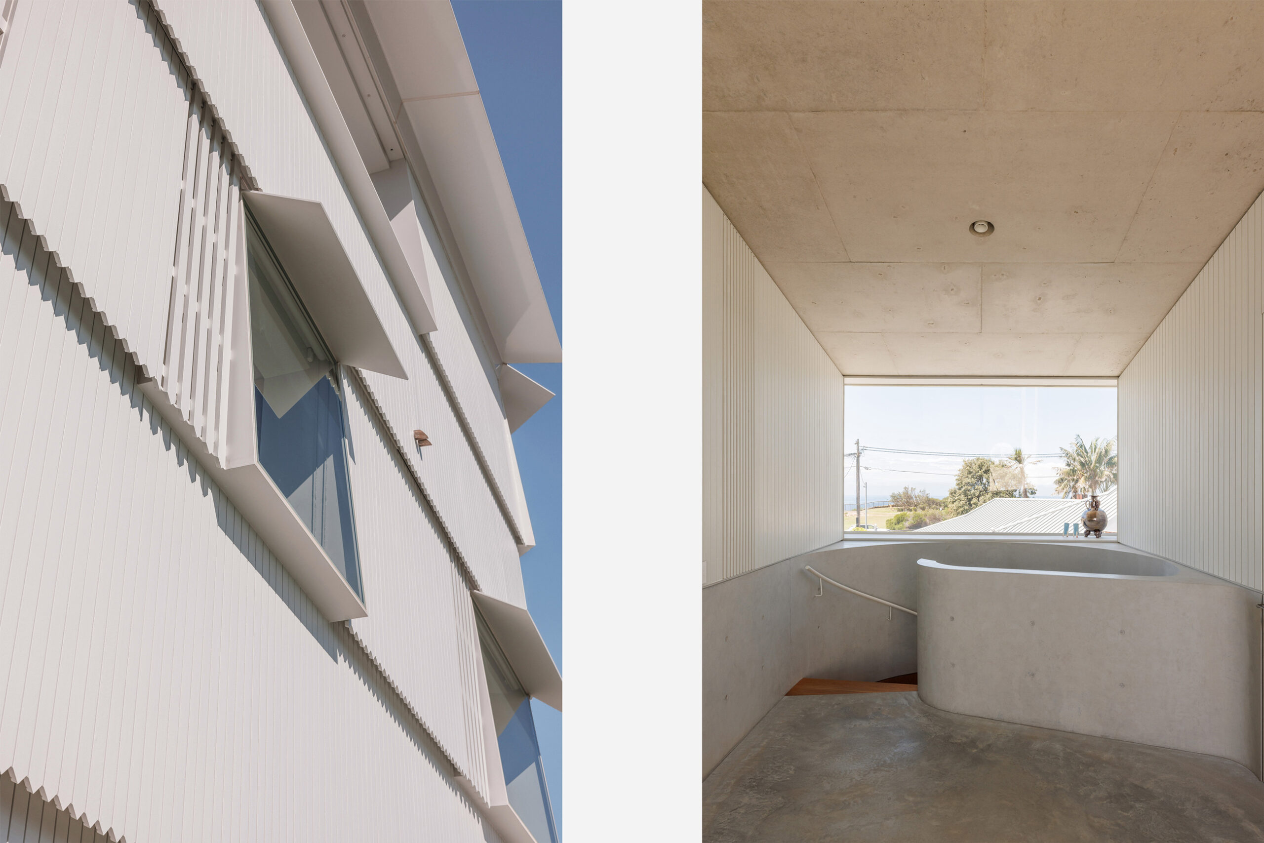

These benchmarks allowed the direction for Shiplap House to be broad. Apart from the need for deep council setbacks on the site and two key materials, the brief was almost open ended. “We wanted to capture the views in the best way possible and we wanted more separation of space than an open-plan design, but apart from that we said, ‘do whatever you want’,” Laura says. “I was happy to see it happen that way being busy with my kids and having full trust in the design team, plus I’ve seen the end result of other projects that have been amazing. It helps to not have any reason to think that you’re not going to get the same result. And Rick and myself are both pretty chill.”
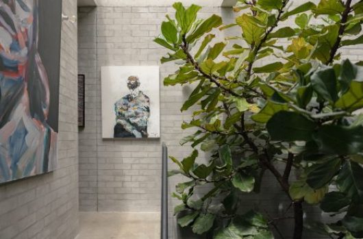
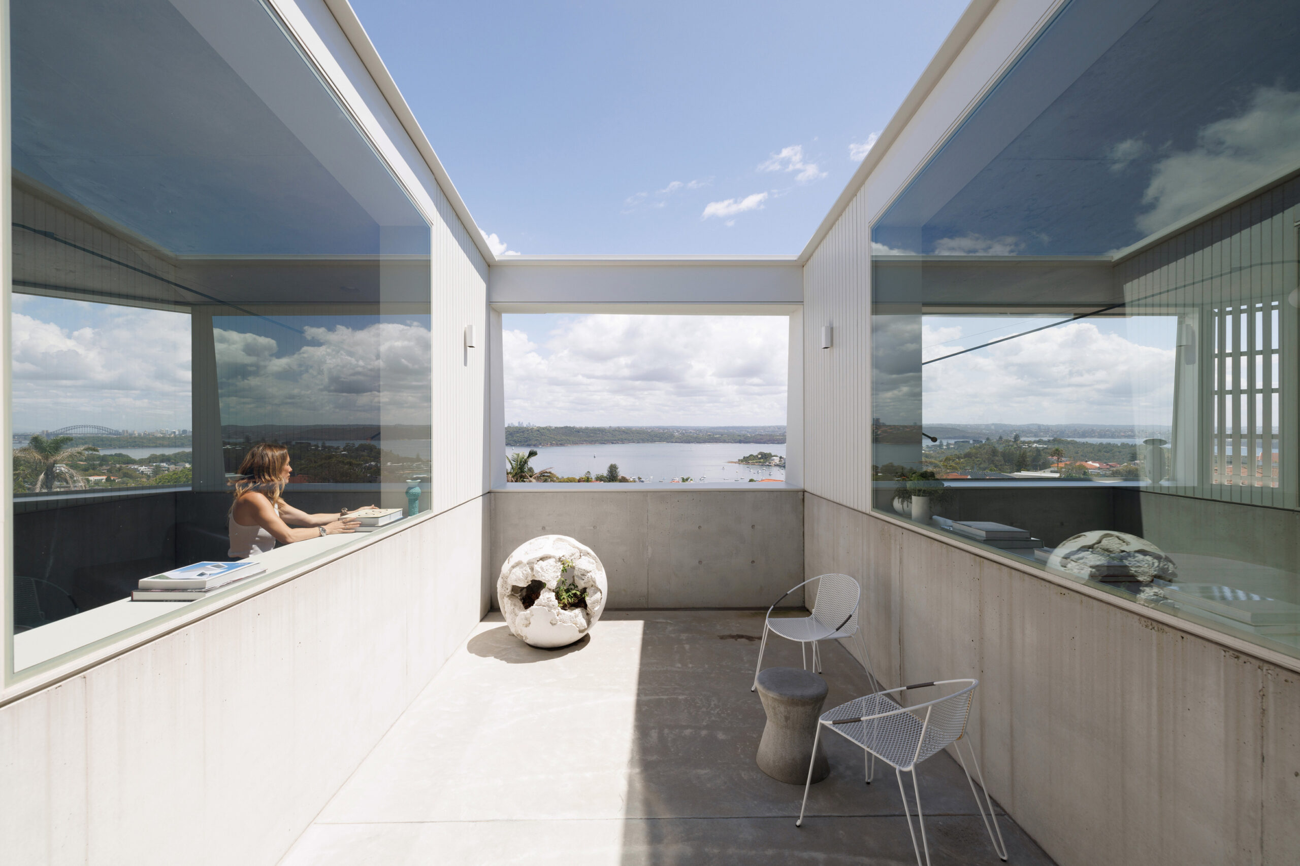
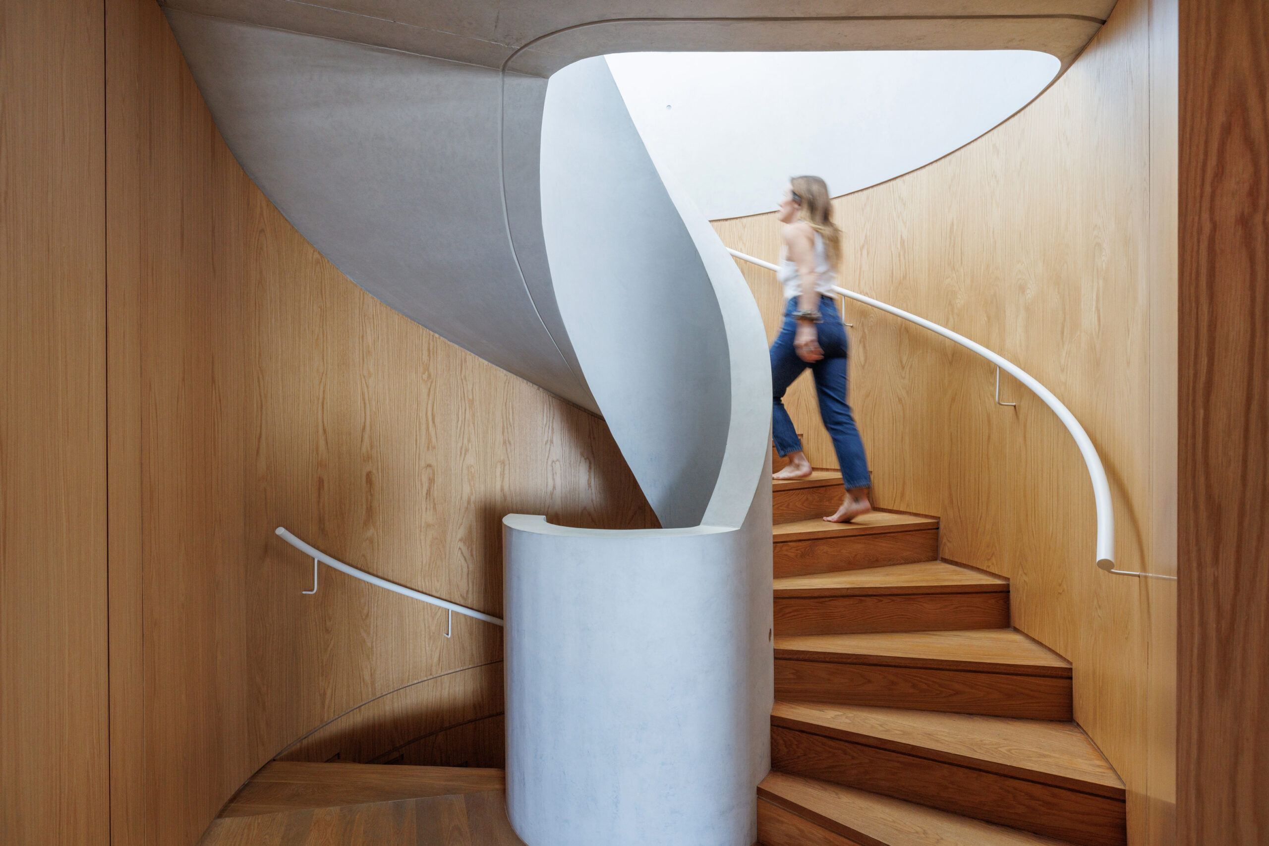
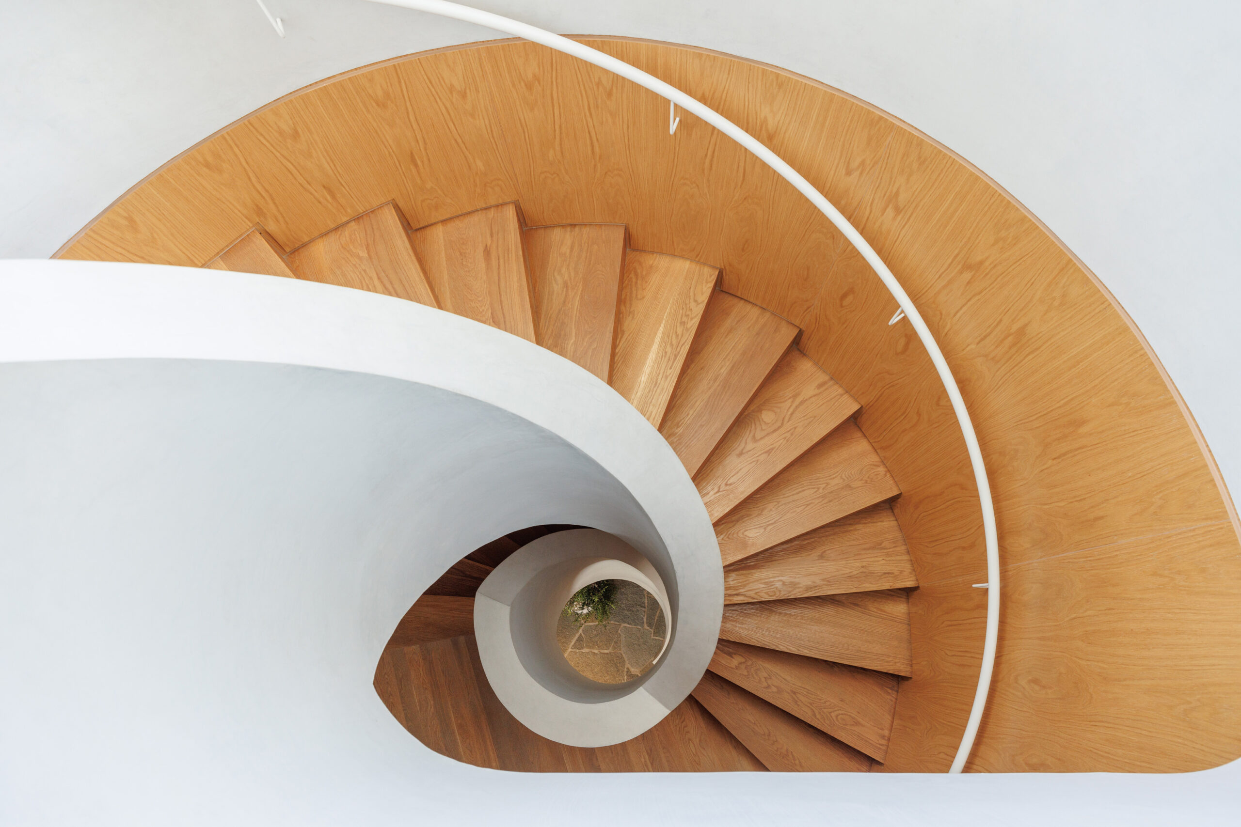
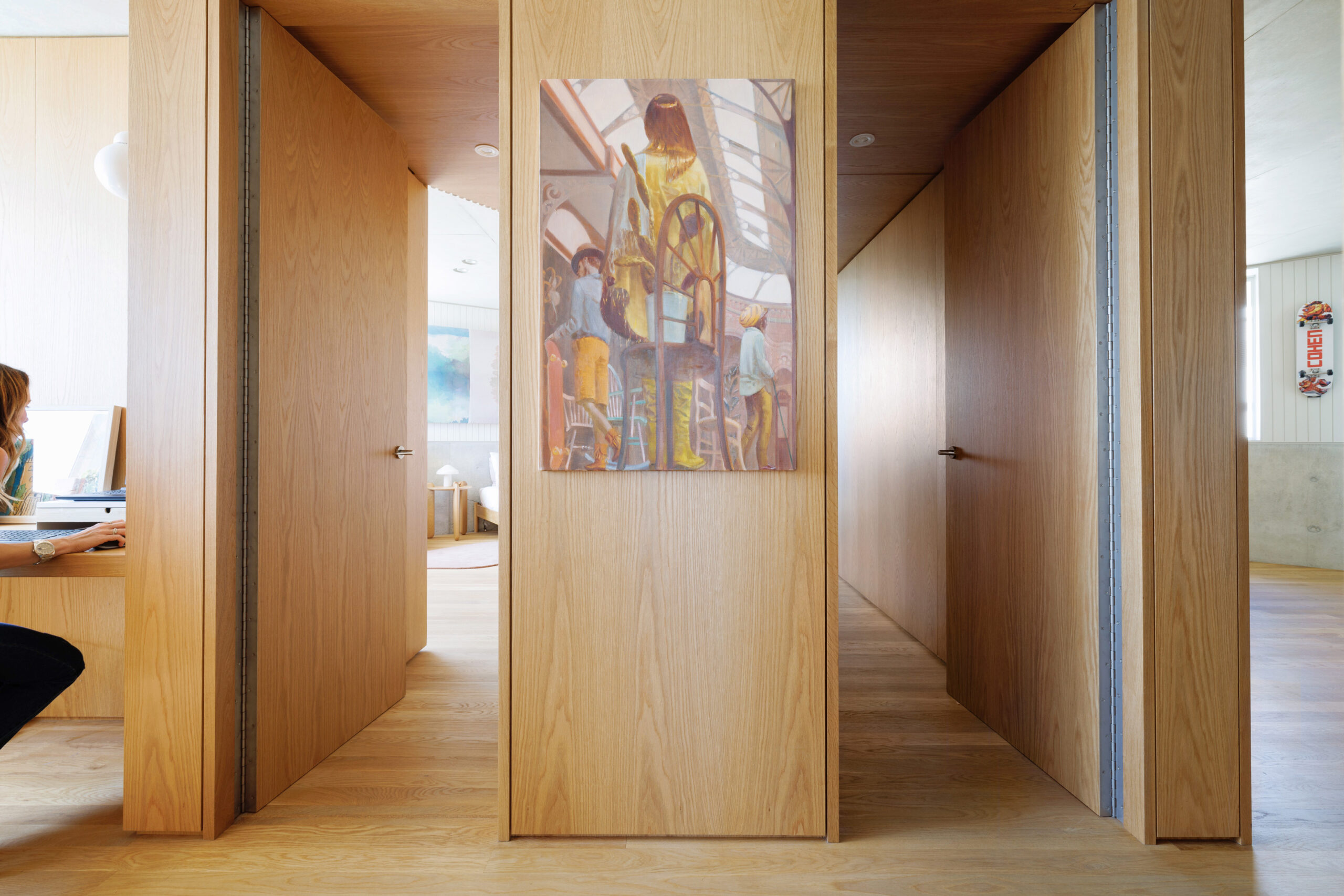
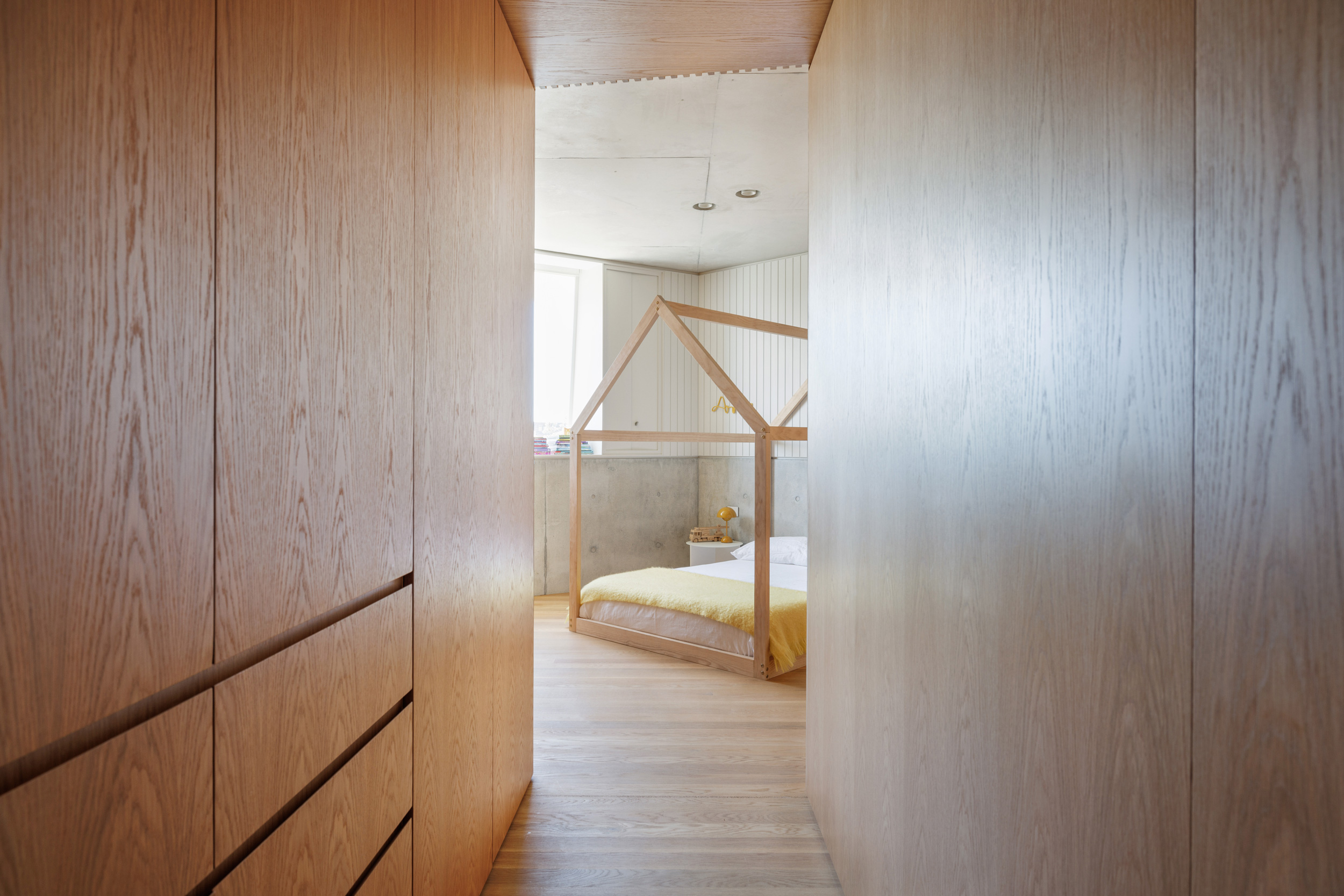
The interior features rich oak paneling wrapping around a sculpted concrete spiral staircase, the angular windows important to the views of the Harbour and Pacific Ocean, while also forming deep platforms that encourages the family to create their own personalised spaces. The ocean perspective stretches out to the south-east and an array of Harbour scenes are experienced through different openings from the kitchen and dining space to the living room. The idea of having separate living spaces is another departure from modern home design. Independent zones allow the family to all be together in the top-floor meals area, with the living space wrapping around the opposite wing. The layered openings and central terrace bring the two spaces together while keeping them free of each other. On the lower level, full-height glass sliding doors frame a large rumpus room.
“For me the idea of having an open expanse in the one space feels like everyone would be living on top of each other, while having some separation works for a family who wants to play together while others are doing homework or working. It takes your home from being something that can be loud and complicated, to something that’s more functional and harmonious.”
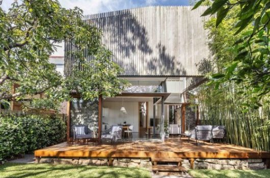
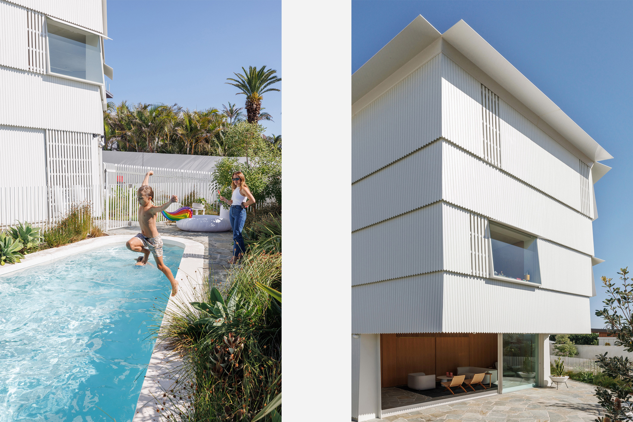
Around the pool area, the garden comprises salt-and wind-tolerant coastal greenery including karkalla, banksia and knobby club-rush, designed by landscape architect Sue Barnsley. It surrounds a flagstone terrace, sheltered beneath the home’s upper floors. An outdoor curved seat runs the perimeter from the edge of the building to the garden, with sight lines that encourage parents to look out across the pool.
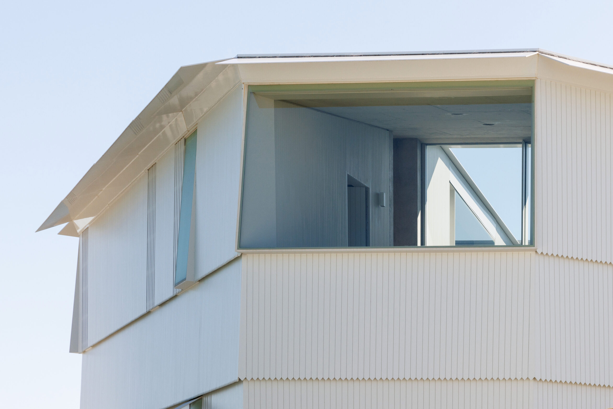
Playfully sophisticated, the home blurs the lines between light and shade, enclosed and open volumes, family and private space, while not an immense structure for a big household. That’s another chapter to the Shiplap House story and a side effect of building a home on a block defined by setbacks to each boundary and council regulations. Rather than restricting the design, ChenChow Little have opened unexpected view corridors to bring an atypical floor plan to life, ensuring the result can be more of a ‘forever home’ in the modern sense of those words.
“It’s a good size so that when the kids all start leaving, I can see this place being still being manageable,” Laura says. “It’s not like having a mega mansion, and when life evolves, you have to make adjustments and downsize to an apartment. This is something that will fit us for a long time.”
