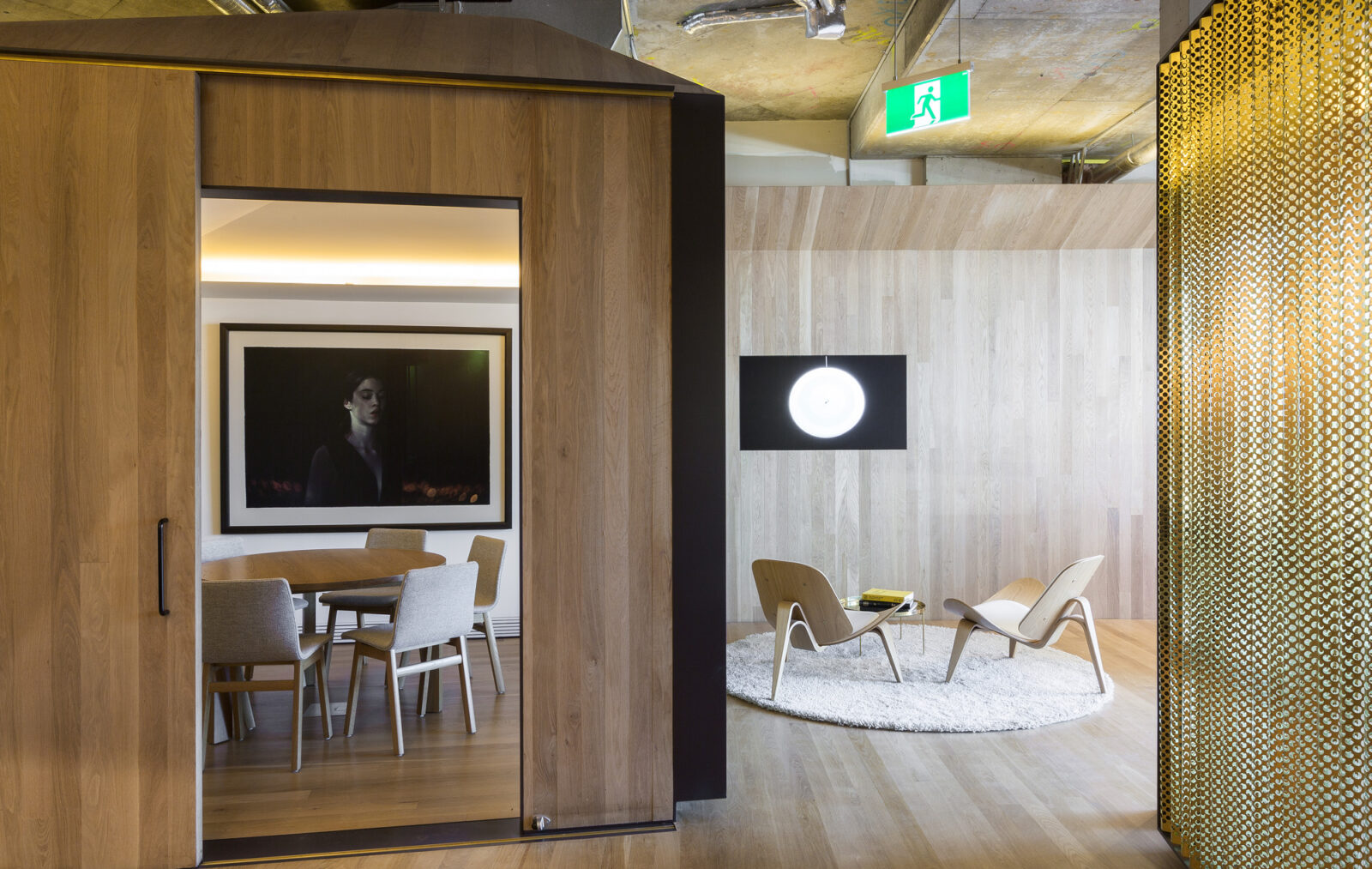
10 years of BresicWhitney design with Chenchow Little Architects
It has been 10 years since BresicWhitney opened a purpose-built office with a design from Chenchow Little Architects. Much has changed during that time, but what hasn’t is a physical environment that continues to redefine what a real estate workspace can be.
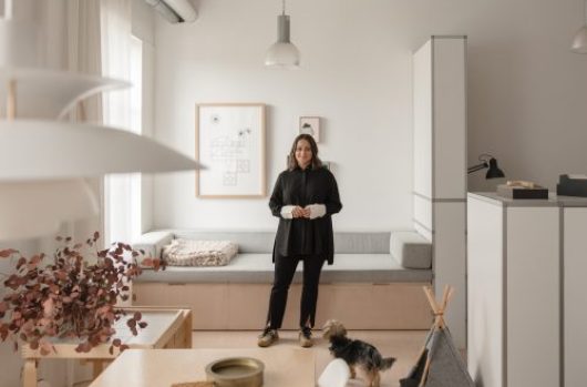
In the years since the Darlinghurst design, Chenchow Little Architects have also been responsible for BresicWhitney offices across Sydney, such as in Hunters Hill and Balmain. With inspired design thinking that looked beyond the traditional role of a real estate agency, architects Tony Chenchow and Stephanie Little look back on the projects, and the vitality, the art and the company that lives within them.
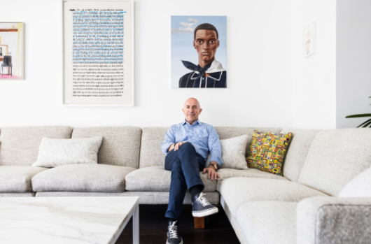
“It’s really nice to come back to the offices and see that it’s still vibrant and full of activity,” Tony says. “It’s also great to see a new generation of staff and clients embrace the spaces we have created and the original vision of the BresicWhitney directors.”


When Chenchow Little was first engaged, the typical real estate office was designed to a predictable formula.
“They all had shopfronts on the street with photos of properties for sale and featured a lot of really brightly-coloured signage,” Stephanie says. “Each agency was almost identical to each other.”
“The brief for the first BresicWhitney project couldn’t have been more different. With no shopfront at all, we knew we had to re-think what a real estate agency could be and find a new design approach.”
The ideation for the office also had to incorporate the core values of BresicWhitney. The workspace needed to foster collaboration and interaction between the staff, while also housing this group’s significant art collection.
To position the offices as part of their neighbourhoods, each post also had to reflect the community in which is was situated. Just as each suburb has its own identity, each of the offices have their own character and language, connecting them to their locations.
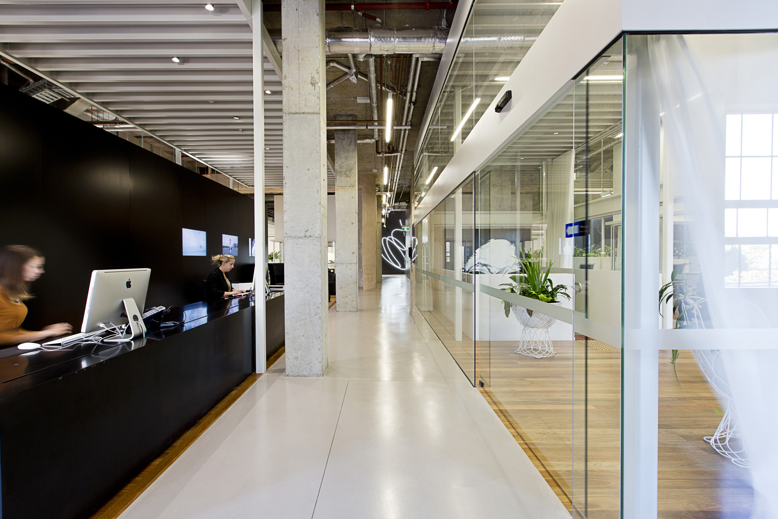

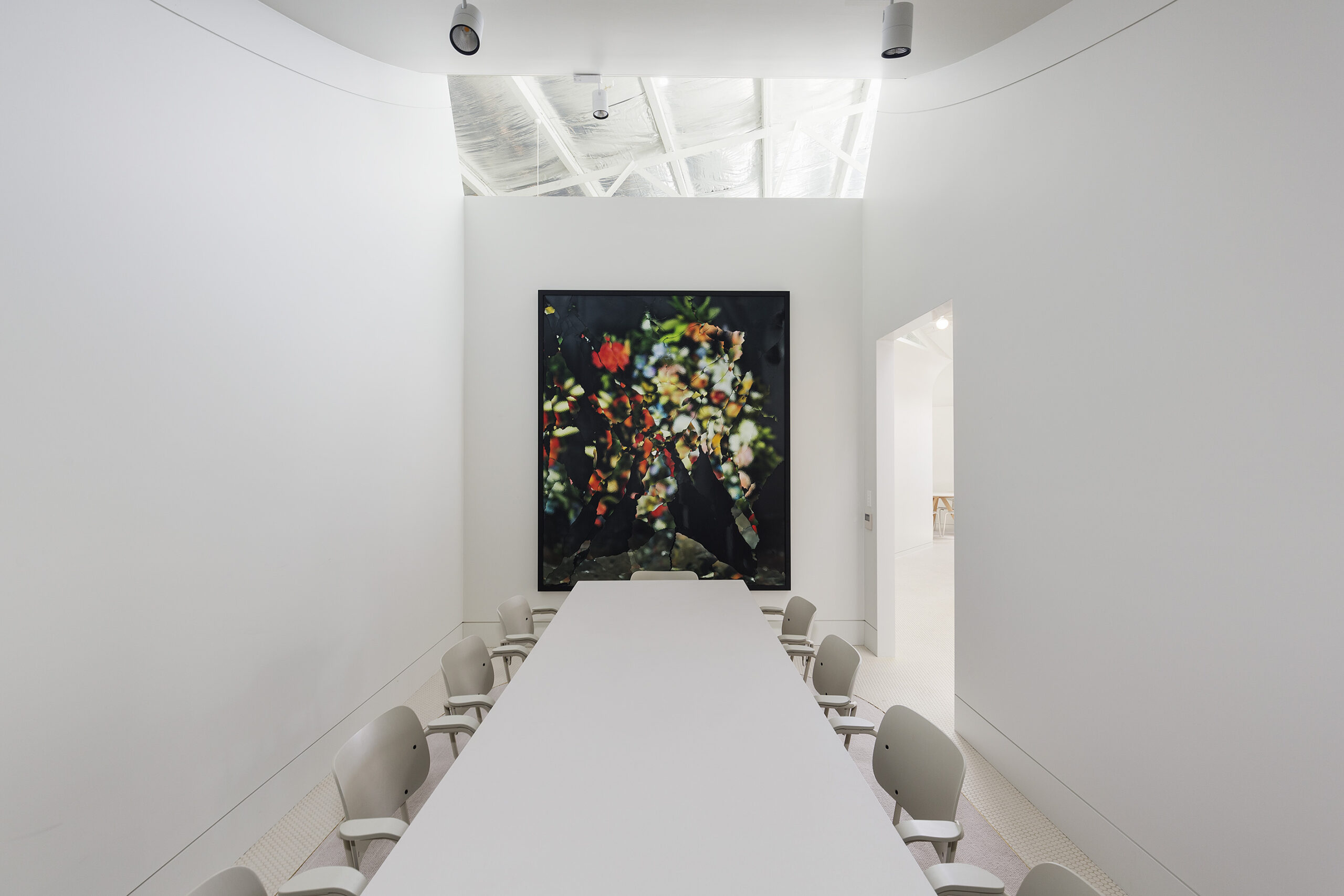
“We thought, what if we looked at the project as an urban design problem?” Stephanie says. “What if we were able to extend the city grid into the building and overlay it with interior space along with its urban paths, gathering spaces and varied functions? With the circulation designed as streets, and the meeting rooms as buildings along those streets, and the workplaces as kind of a communal marketplace where deals were done.”
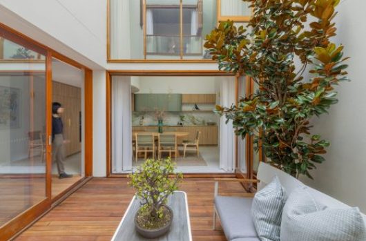
In suburban Hunters Hill, the interior is warmer with traditional materials of timber and brass reflecting its heritage. In Balmain, the Chenchow Little design response reflects the quaint heritage houses of the suburb, with a curved wall wrapping around a main space, creating meeting rooms which appear as cottages within a garden.
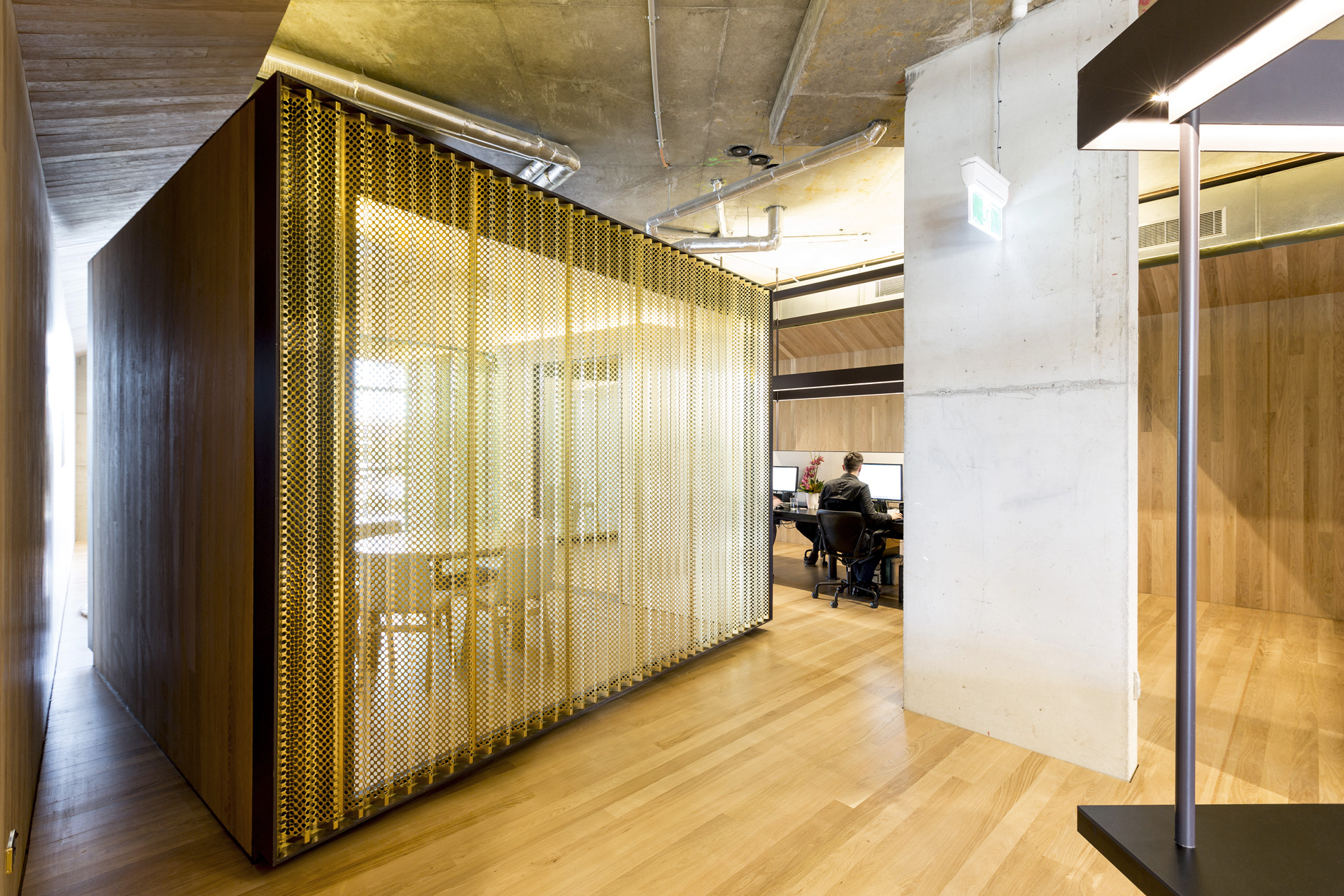
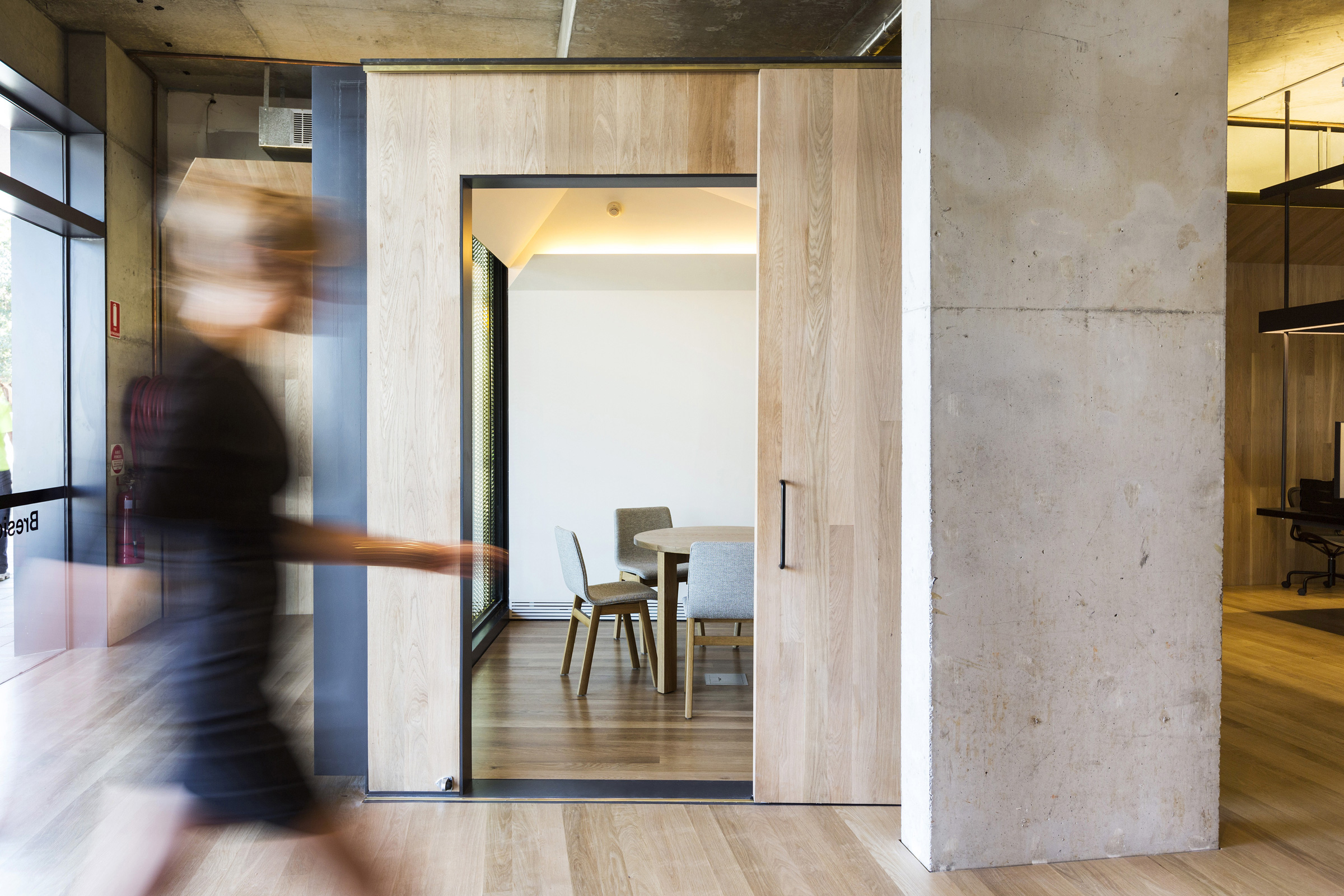
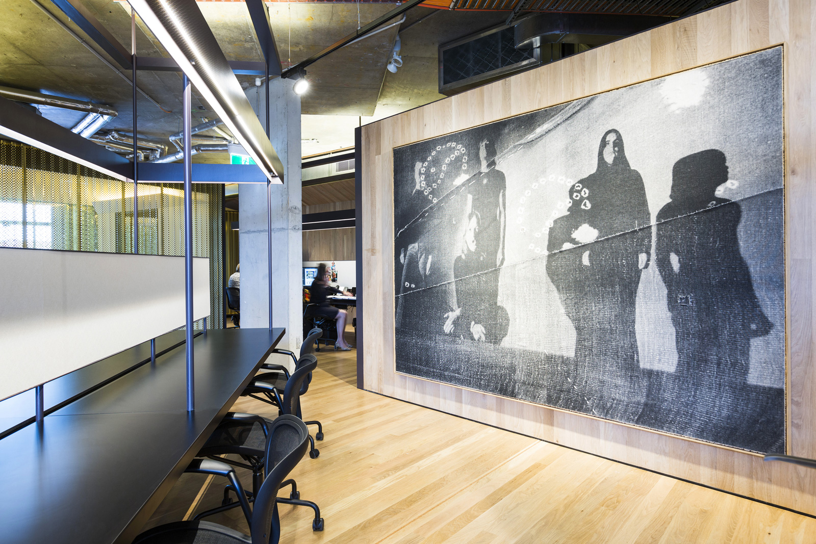
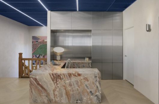
“In the Darlinghurst office we wanted the boundaries between private and public spaces to be blurred so the visitor could see the inner workings of an agency,” Stephanie says. “The paths around this office connect the different working spaces and meeting rooms. The meeting rooms are enclosed with curtains and sliding doors when privacy is necessary, but we could completely open these to the paths or the general working space for larger gatherings.” The area’s spatial strategy ensures it is a non-hierarchical environment to this day, and one that reflects an egalitarian ethos through encouraging public participation.
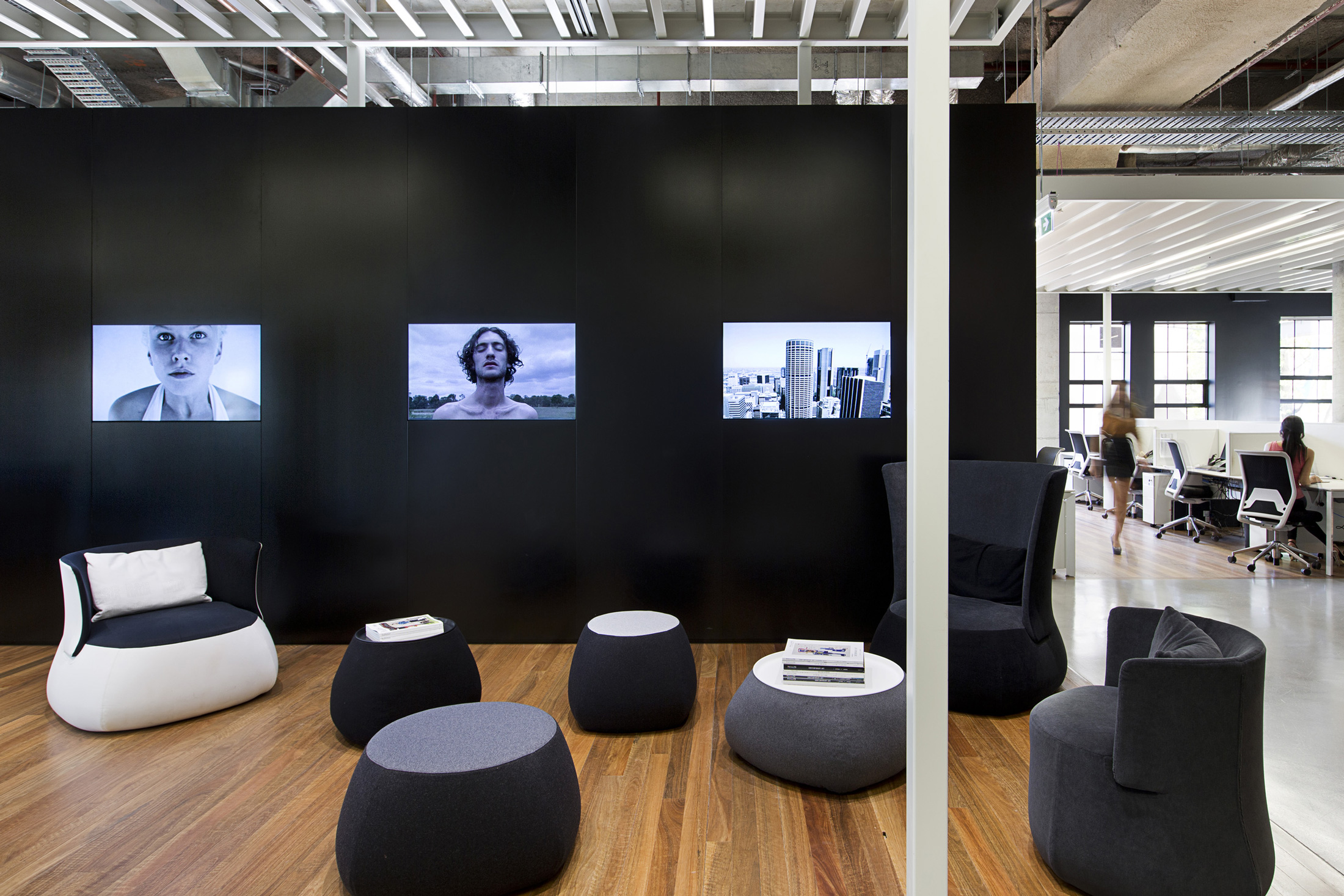

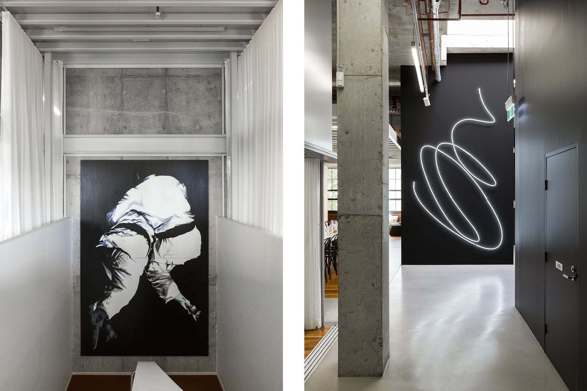

On the main pathways around the office, visitors and staff can experience a growing contemporary art collection from paintings to photography, video installations and neon art. In a democratic configuration, the artwork spreads throughout the office in a way that provokes thought and fosters interaction.
“The joy was really in collaborating with (agent and co-founder) Shannan Whitney and the BresicWhitney team,” Stephanie Little says.
“They were so encouraging and enthusiastic about the project and they really offered a different way of looking at real estate agencies that we never expected at the outset.”
